Agarikus / MojoBite
Brand Launch: MojoBite Consumer Website Imagery
How It Started
The inquiry came through a referral - Maria Todorova, Brand Manager for MojoBite, reached out about product photography for their new consumer brand. Agarikus BG had been manufacturing nutritional bars under private-label contracts for years. Now they were launching MojoBite as their own brand and needed imagery for the website, online store, and social channels.
The project paused early on while the client completed a full packaging redesign - rethinking how the product’s health benefits and ingredients would be communicated on the wrapper. When photography resumed, the brief had sharpened: the new imagery needed to match the new brand ambition. Simple catalog shots wouldn’t cut it.
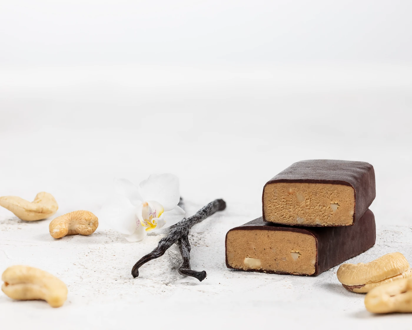
Creative Direction: Styled, Not Documented
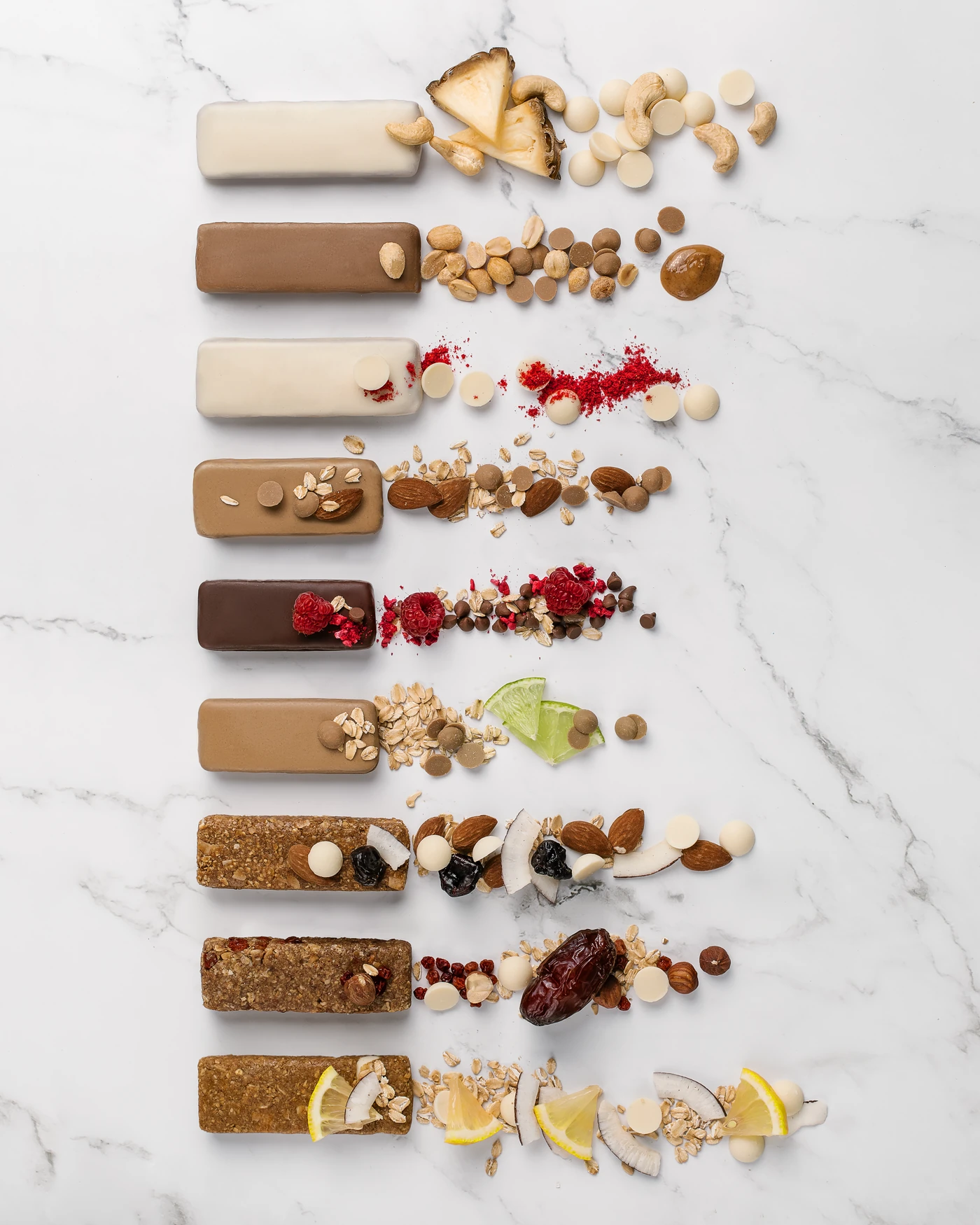
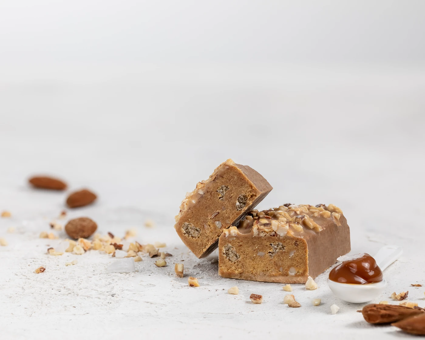
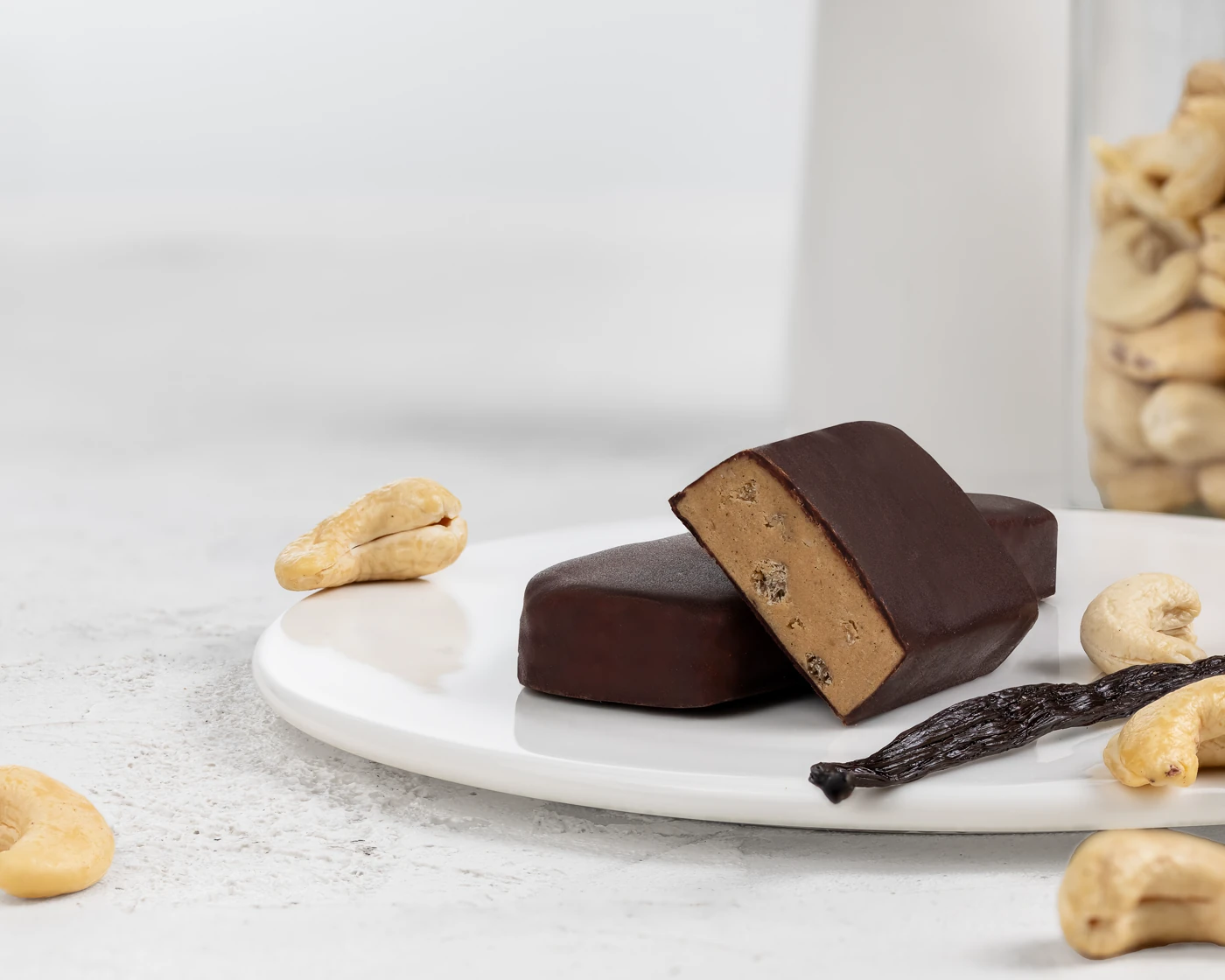
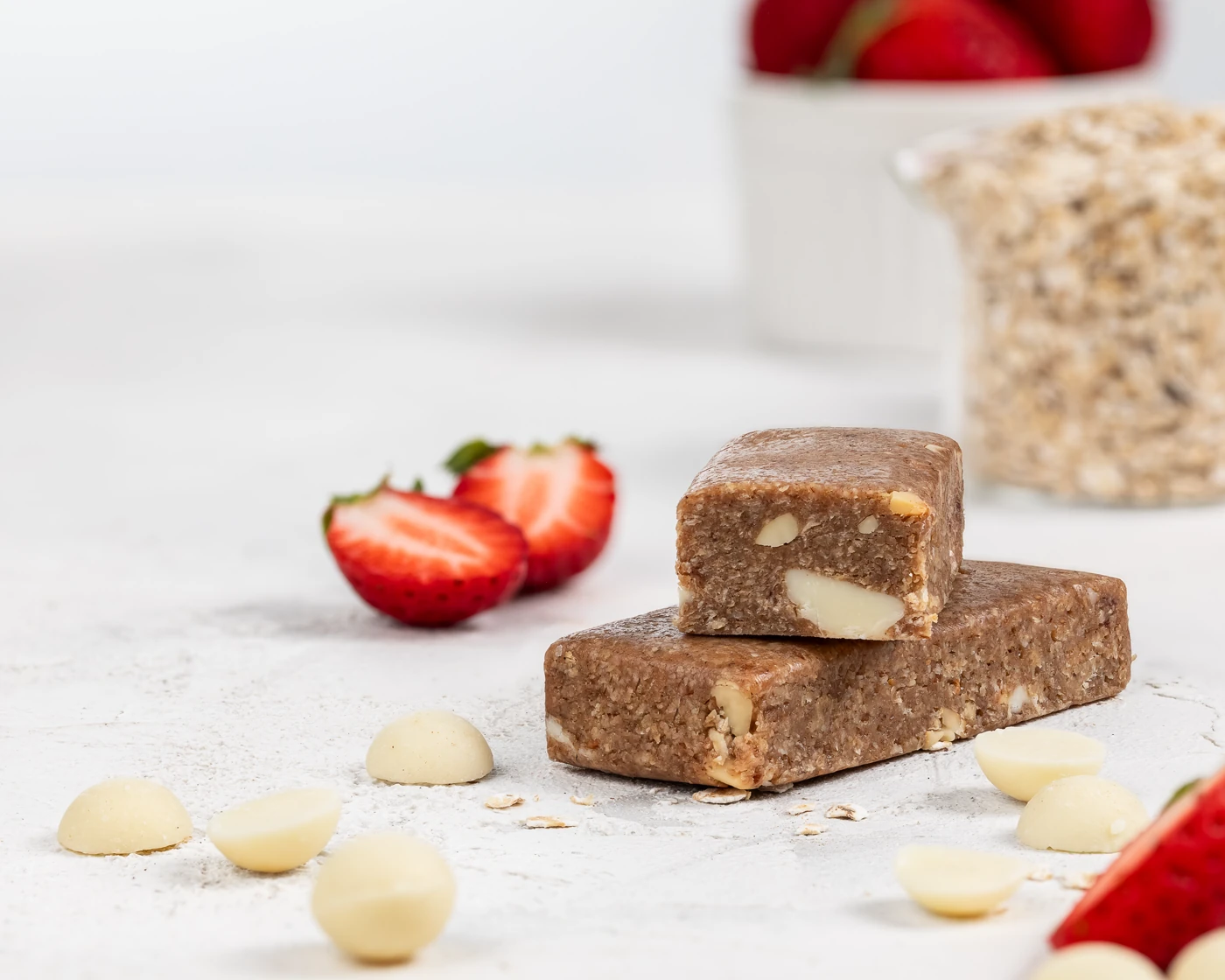
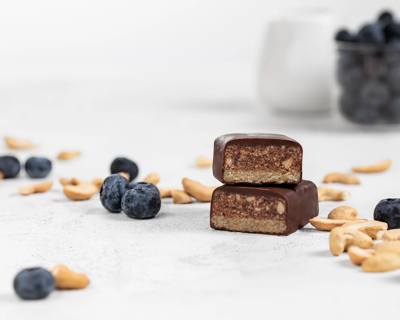
We proposed styled photography - taking cues from brands like GoMacro, where clean minimalist compositions put the focus on natural ingredients and product texture.
The concept centered on the unwrapped bar. Since much of Agarikus’s production is white-label, the visual identity had to work without relying on branded packaging. Every frame answers the question: “What’s inside this bar?”
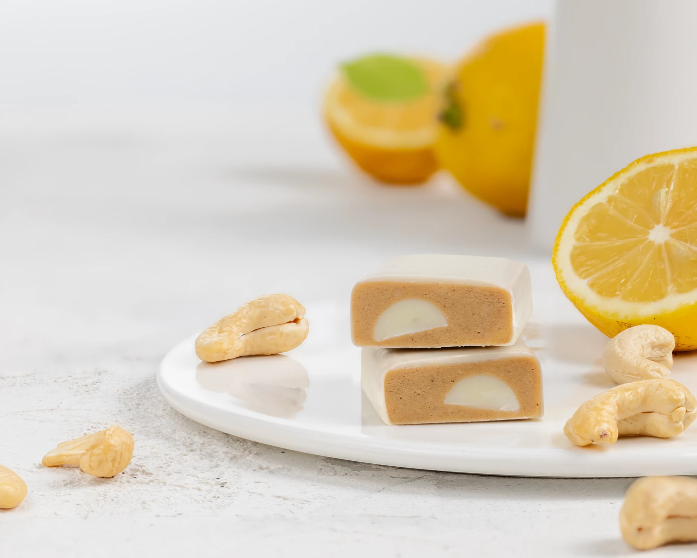
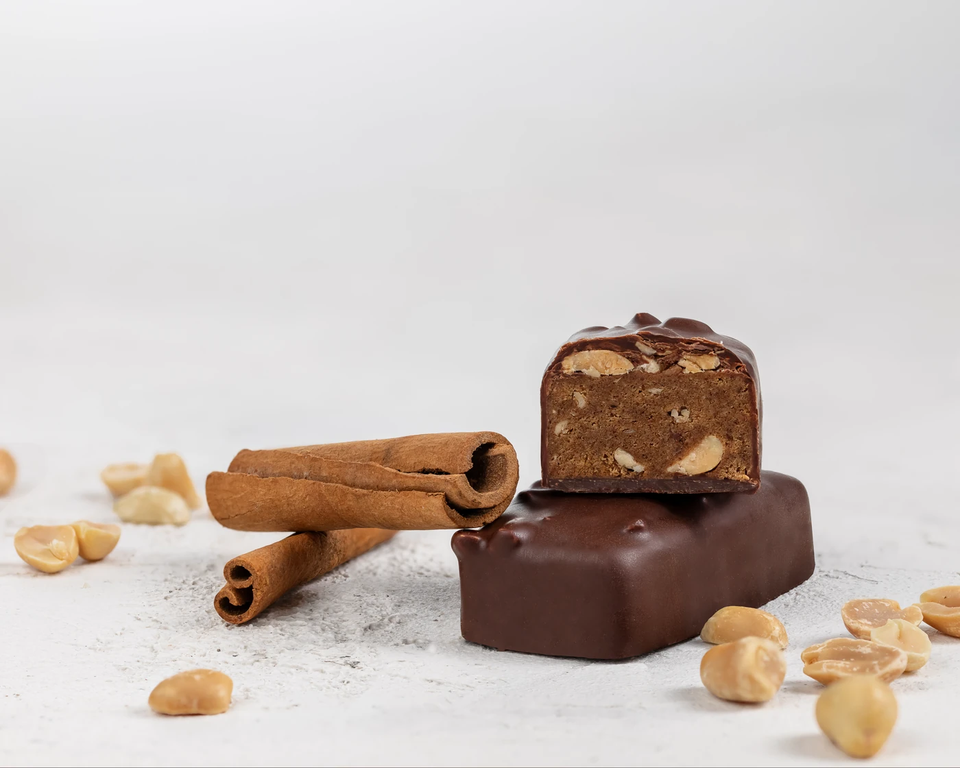
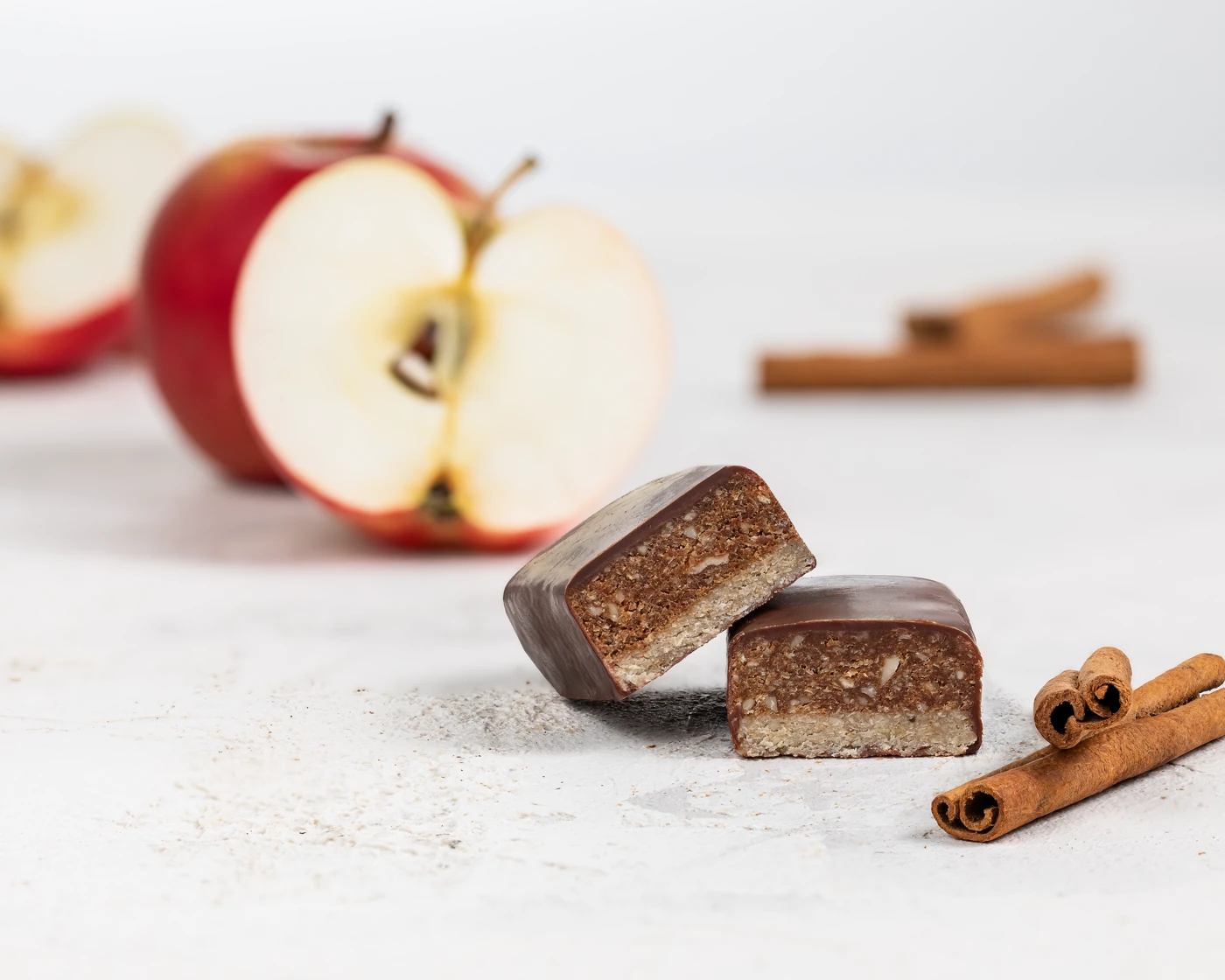
Each bar was broken to reveal its cross-section - fillings, layers, textures - and styled with one or two of its key ingredients. Fresh lemons for citrus flavors. Cinnamon sticks and peanuts for spiced protein bars. Blueberries and cashews for double layers. The ingredients do the storytelling.
Designed for the Website
We coordinated directly with Pavlina Sharova, the web designer behind mojobite.com, to ensure every composition fit the updated site layout. All images were shot in 4x5 vertical format - flexible enough to crop to 1x1 for social media and Instagram without losing impact.
The compositions were built to work at two scales: category landing pages (where the image carries the entire section) and individual product pages (where it sits alongside specs and descriptions). This dual purpose drove every framing decision.
Five Categories, One Visual Language
The MojoBite range spans Plant-Based Protein, Low Sugar Protein, Oat Bars, Double Layer, and Collagen - each with its own personality. The ingredient palette shifts across categories, but the visual rules stay consistent: marble surface, broken bar showing the cross-section, signature ingredients, clean negative space.
The Craft Behind the Shots
Focus stacking. Each final image is a composite of 15-20 individual photographs at different focus points. When a bar, scattered cashews, and a caramel jar occupy different focal planes, a single exposure can’t keep everything sharp. Our technique merges them into one image where every element is perfectly crisp.
Proactive ingredient sourcing. Our photographer personally sourced the styling props - liquid caramel, fresh lemons, seasonal strawberries, toasted nuts, cinnamon sticks. When you’re working with real caramel under studio lights, timing and consistency matter. The client shipped the bars; we handled everything else.
Retouching handmade imperfections. Artisan bars have natural surface cracks, irregular edges, coating variations. The client needed these cleaned up for the website, but the retouching couldn’t make the bars look industrial. We addressed every defect while preserving the handmade character. The client confirmed: “All the defects we previously noted have been fixed, and the images look very good.”
What the Client Got
A visual system that launched as the backbone of mojobite.com - product images across all five categories, built for the website layout and croppable to social formats. One consistent language where a collagen bar and an oat bar both feel unmistakably MojoBite.
See also: B2B Production Catalog - the earlier project that built the trust for this consumer brand work.