Agarikus / MojoBite
B2B Production Catalog: White-Label Nutritional Bars
The Brief
Agarikus BG is a private-label manufacturer of functional nutritional bars. Before MojoBite became their own consumer brand, the company was already producing bars under contract for other brands across Europe. They needed a catalog - images for wholesale presentations, trade shows, and B2B sales decks.
The typical approach to this kind of brief is clinical: white background, bar in the center, maybe a cross-section. Functional. Forgettable.
We saw an opportunity to do something different.
The Idea: Treat Every Bar Like a Dish
Instead of documenting bars, we decided to style them like food. Each bar variety got its own visual world - built around its flavor profile, its key ingredients, and the feeling it should evoke. Marble surfaces instead of white straightforward. Fresh ingredients as props. Caramel and chocolate drizzles caught mid-pour.
The logic was simple: wholesale buyers are still people. They respond to appetite appeal. A catalog where every image makes you want to pick up the bar and taste it is a catalog that converts.
How We Shot It
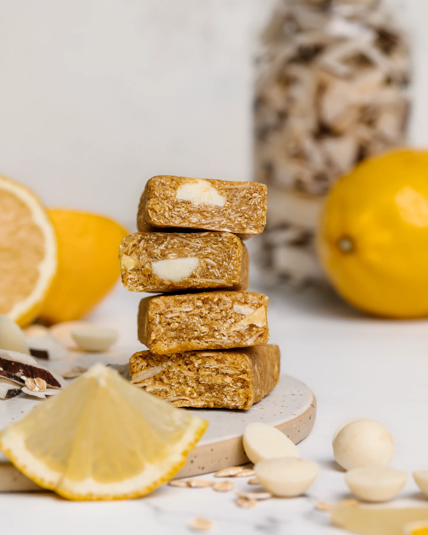
Cross-Sections That Tell a Story
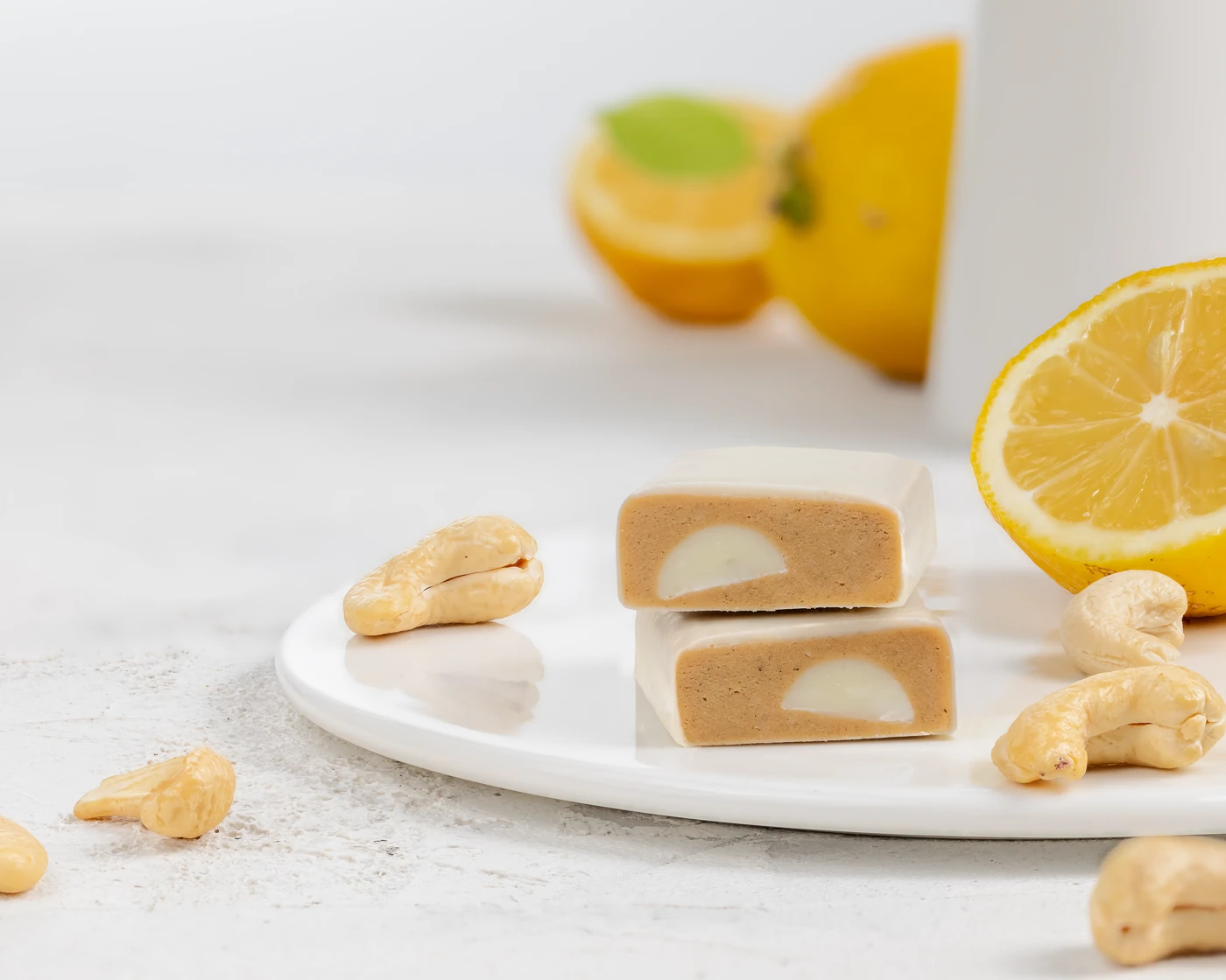
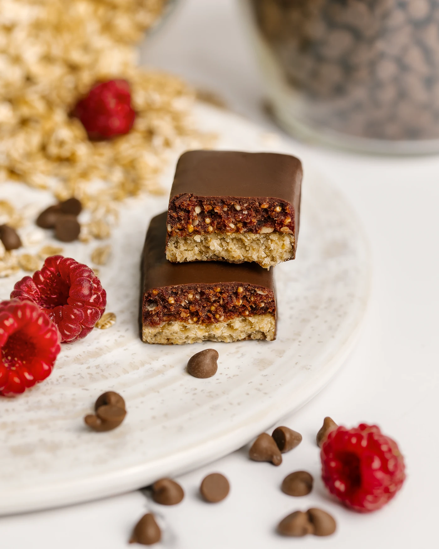
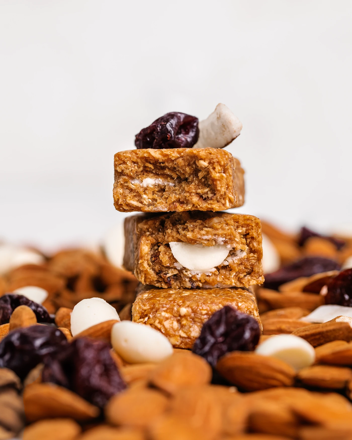
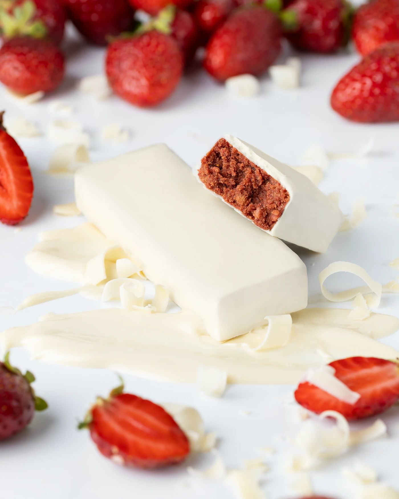
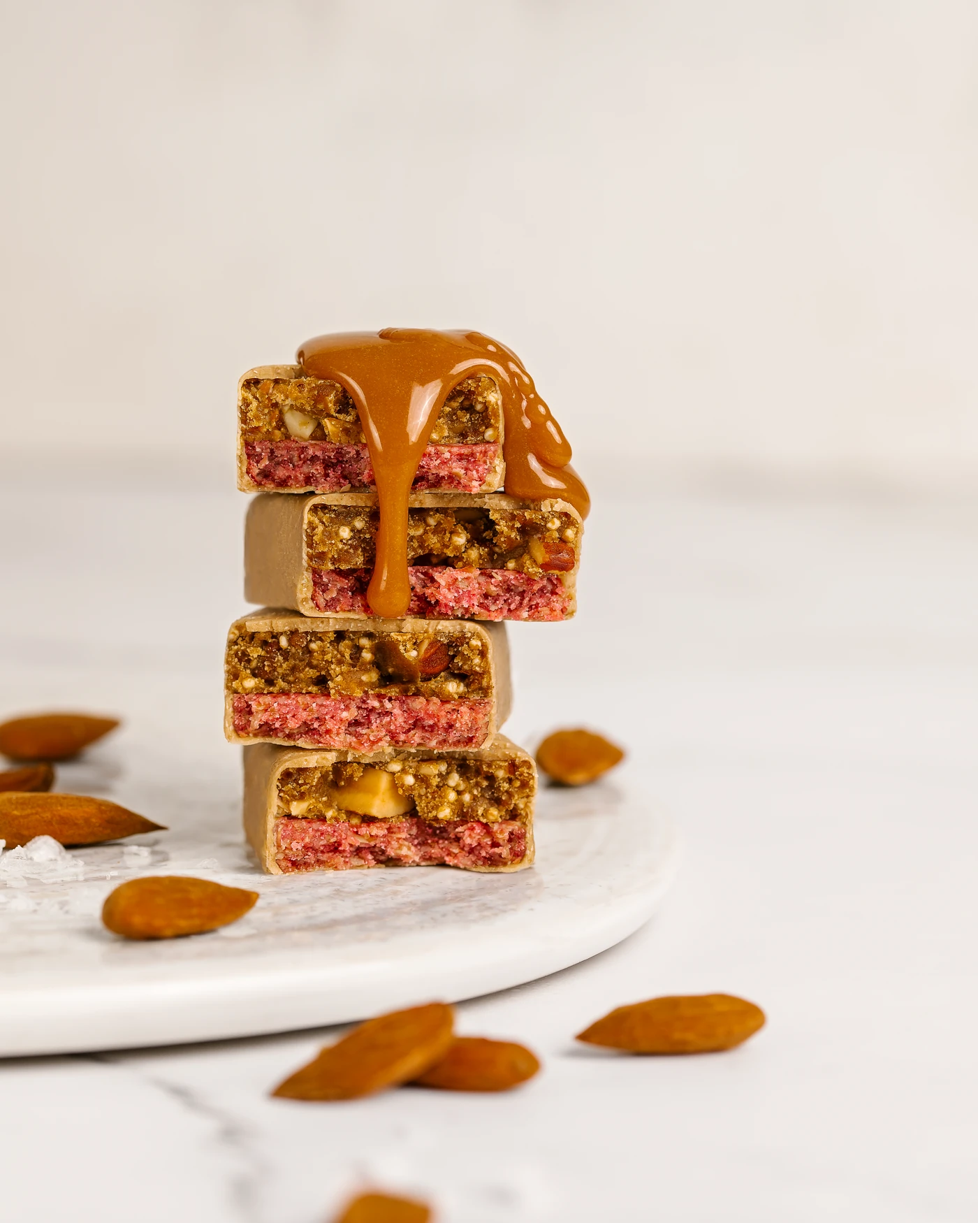
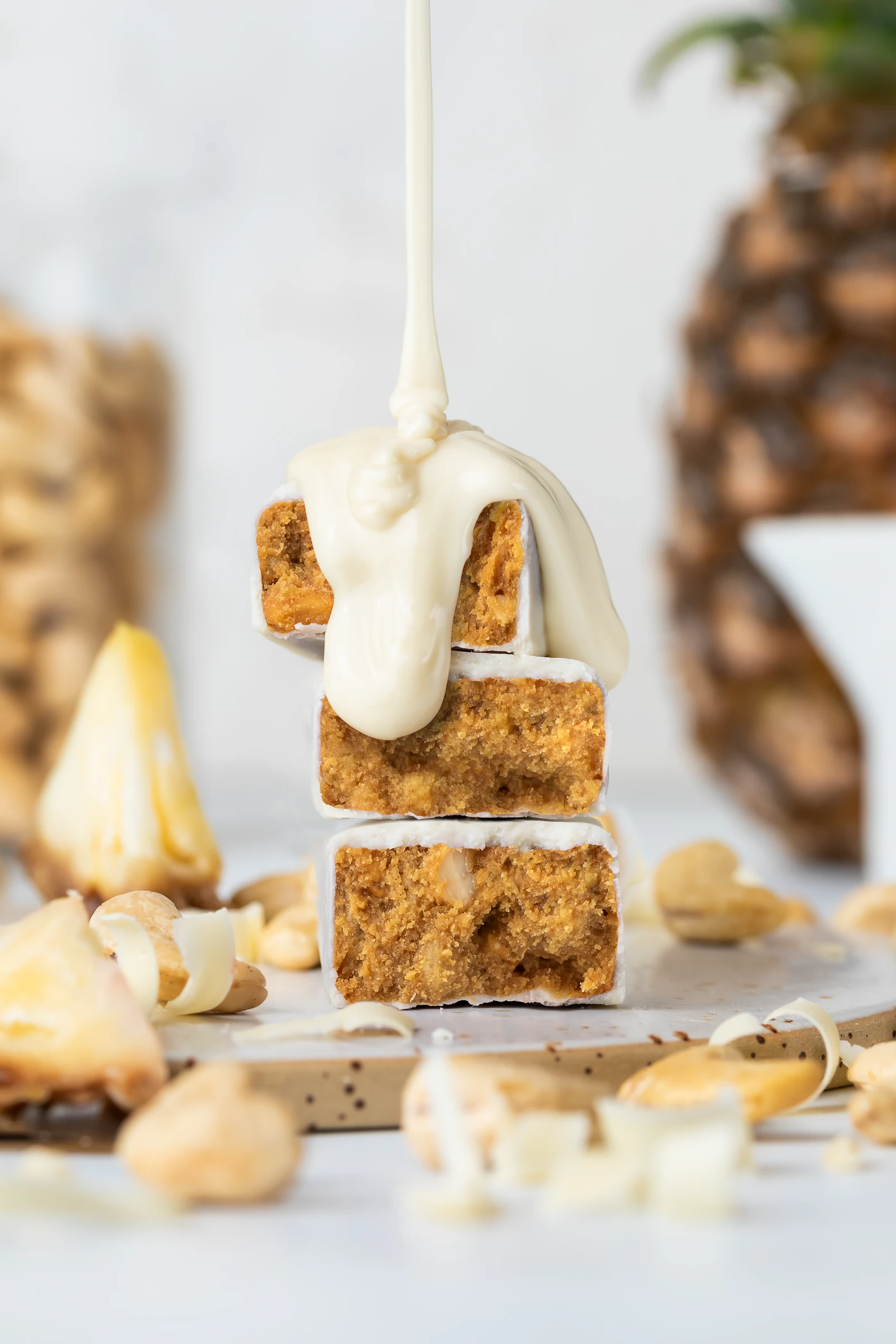
Every bar was cut to reveal its interior layers - not as a technical diagram, but as a way to show the craft inside. Stacked cross-sections on a bed of almonds and cranberries. Pink strawberry filling peeking through white chocolate coating. Caramel and oat layers visible in a clean break. The cross-section became the visual signature of the entire set.
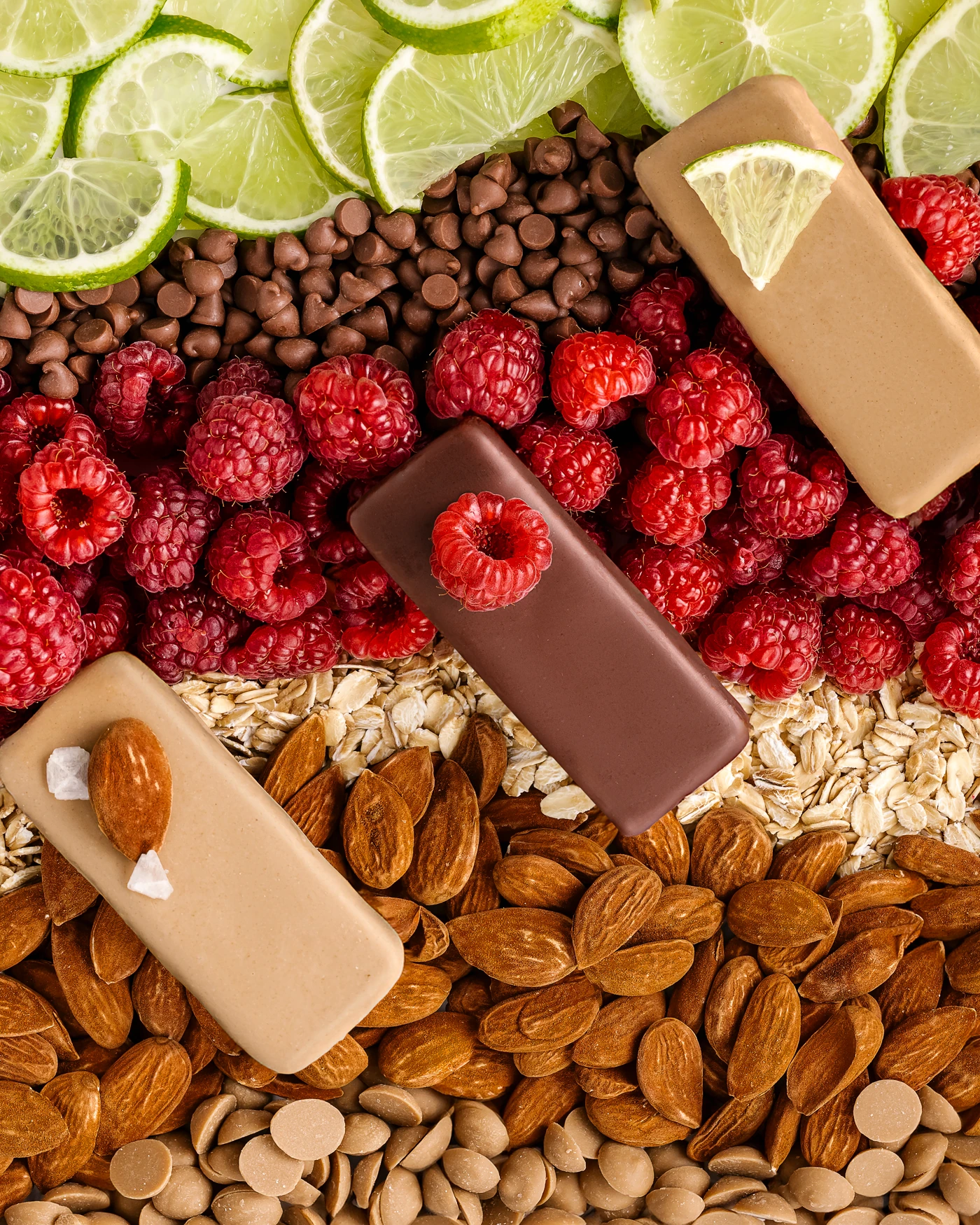
Ingredient Worlds
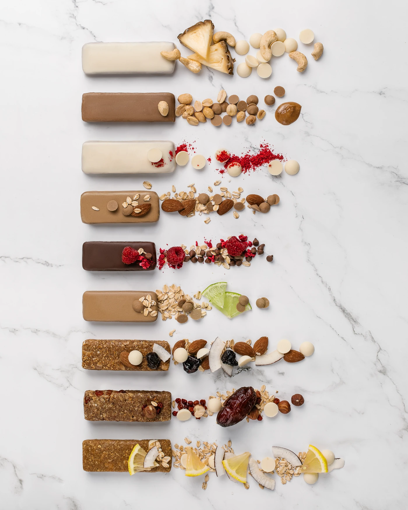
For the group shots, we built dense ingredient compositions - raspberries, almonds, lime slices, chocolate chips, oats - and placed the bars directly into them. The result reads less like a catalog and more like a food magazine spread. Each frame communicates the bar’s formulation without needing a single line of text.
Pour and Drizzle Shots
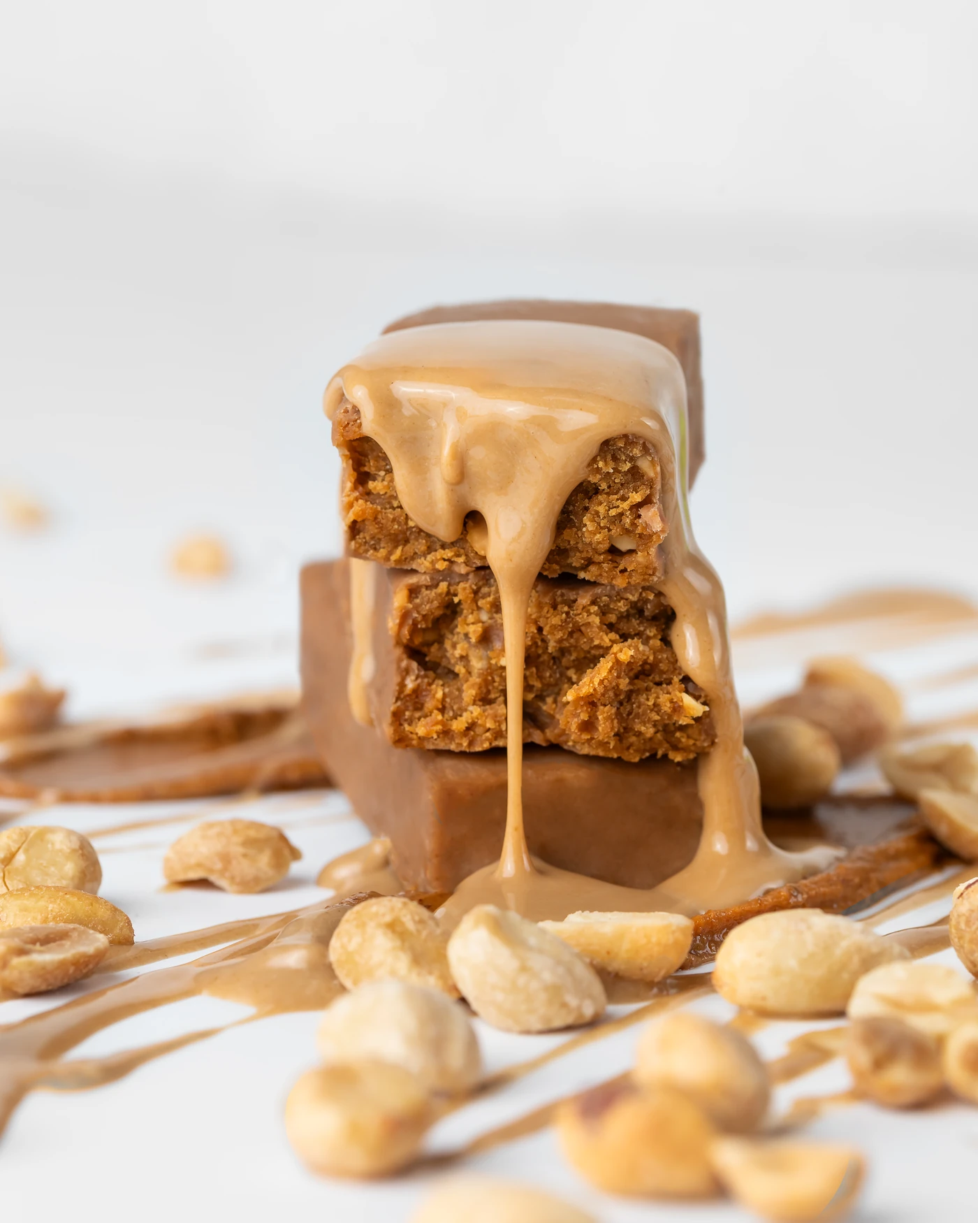
To add energy, we introduced pours - peanut butter drizzling down a stacked cross-section, white chocolate coating a pineapple cashew bar mid-pour, caramel catching the light as it falls onto a berry bar stack. These shots give the catalog a sense of movement that static product photography rarely achieves.
The Technical Side
Focus Stacking
Each final image is a composite of 15-20 individual photographs captured at different focus points, then merged in post-production. This technique ensures every element - the bar’s surface texture, the scattered almonds, the ingredient props behind - is perfectly sharp in the final result. When the client raised a concern about sharpness in low-res previews, we walked them through the process and delivered full-resolution files that put the question to rest.
Retouching: Fix the Flaws, Keep the Character
Handmade bars are imperfect - subtle cracks, irregular edges, surface variations. The client needed these cleaned up for the catalog, but the retouching couldn’t make the bars look industrial. We addressed every defect they flagged while preserving the handmade texture that differentiates artisan production from factory output. The client confirmed: “All the defects we previously noted have been fixed, and the images look very good.”
What the Client Got
A set of images originally scoped as a B2B catalog - but built to a standard that works far beyond wholesale presentations. The same images translate directly to consumer marketing, social media, packaging mockups, and trade show materials. The client didn’t need to reshoot when MojoBite later launched as a consumer brand - the visual foundation was already there.
This project built the trust that led to the subsequent MojoBite consumer brand photography - where the brief expanded from catalog to full creative storytelling.