AMADA
Building AMADA's Visual System for Five-Star Hotel Cosmetics
A Saturday inquiry
AMADA makes cosmetics for five-star hotels, using pure Bulgarian rose oil where most of the category uses rose water. The brand was launching seven new products and had no photographs of any of them. The inquiry came in on a Saturday afternoon, asking for catalog photography and images for amadaorg.com.
We sent a proposal the next morning. Less than two hours later the client asked whether we could shoot that same week. Five days after the first email, the seven catalog packshots were approved.
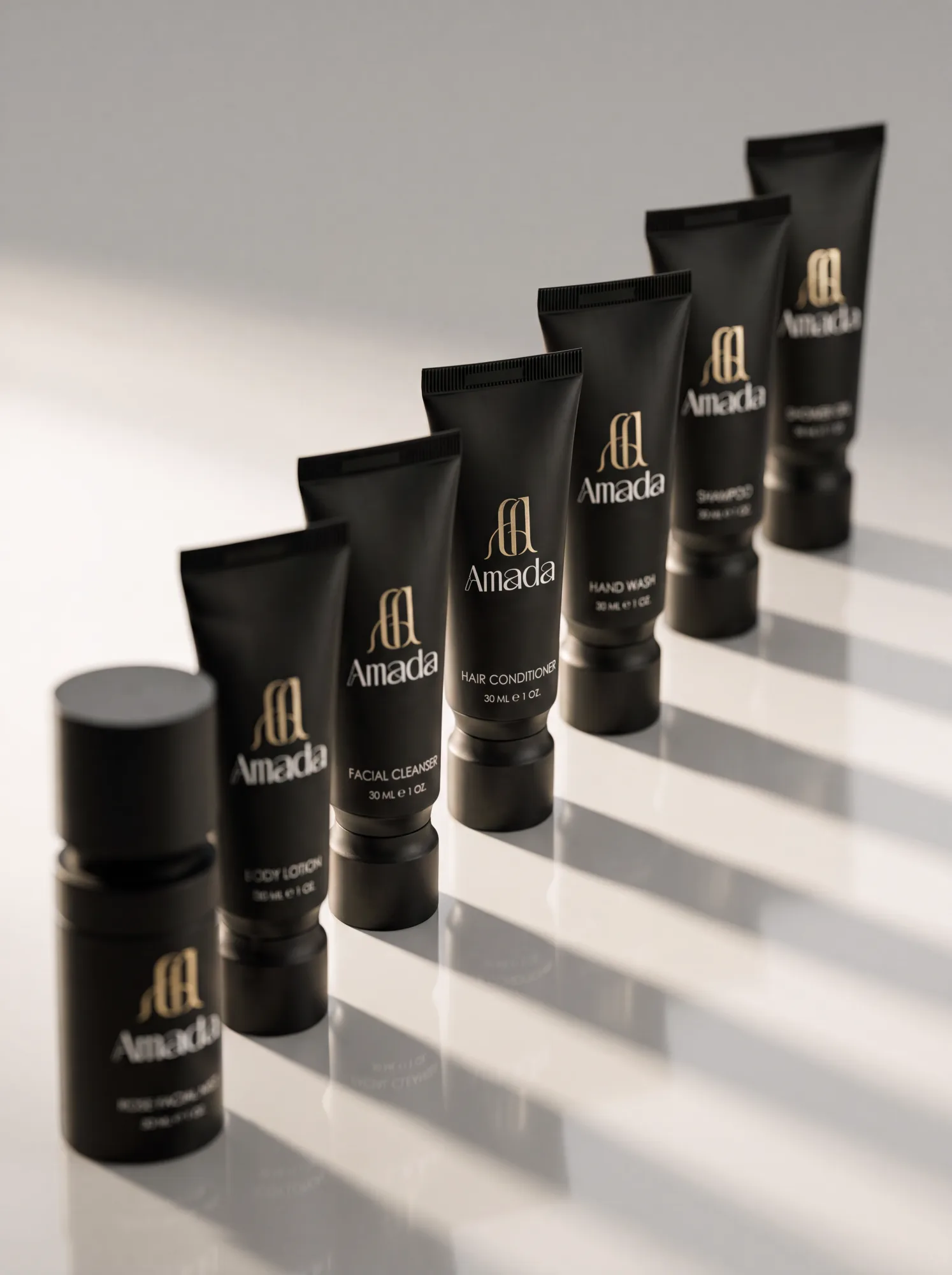
The samples arrived at our Sofia studio on Monday: six tubes, a facial mist and the presentation box. Olga, our co-founder and photographer, looked them over that afternoon and emailed the client before taking a single shot. The finish was matte, almost velvet, with glossy lettering on top, and she warned that it would be hard to light.
AMADA’s reply set the target in their own words: “We want to position ourselves in the high segment of luxury hotel cosmetics.”
Lighting matte against gloss
Matte plastic normally gets soft, diffused light. On these tubes it flattened everything. They lost their curve, and the velvet look was gone. Harder light brought the shape back but turned the glossy type and gold foil into white patches, and the brand name became unreadable.
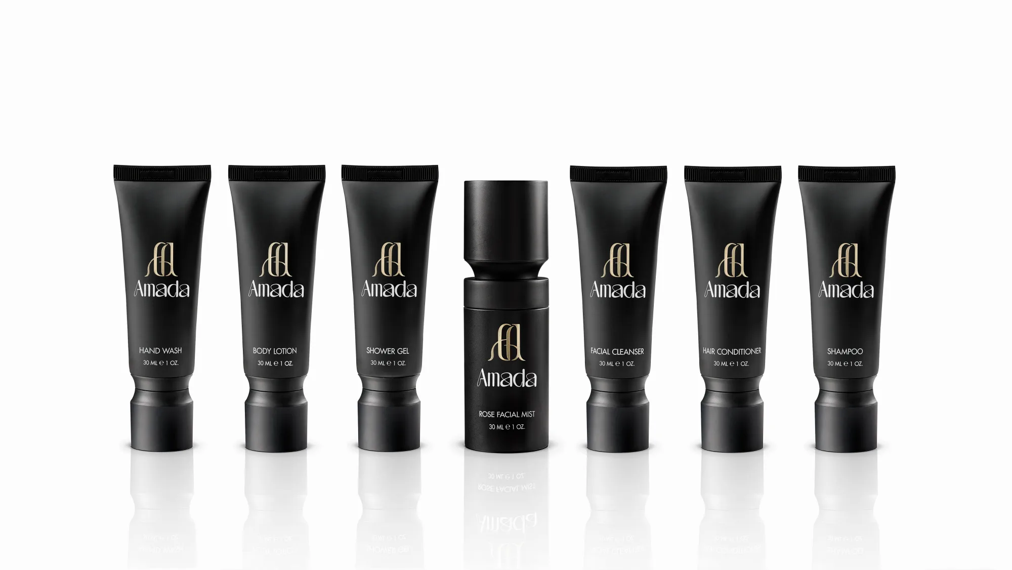
We ended up lighting the tube and the lettering separately. One light shapes the body of the tube and holds its edges. Another is aimed and shaded so it only reaches the printed lettering, and the logo keeps its shine without flaring. All seven products were shot under the same setup, so the catalog pages match.
On Thursday the packshots went up on our review platform. The client approves each image there or drops a marker on the exact spot that needs retouching, so nothing gets lost in email. All seven were approved before midnight, and with the approval AMADA’s team gave the look a name: their “ultra luxury concept”.
When four products look the same
Four of the seven are clear gels: the shampoo, shower gel, facial cleanser and hand wash. In the same black tube all four look identical in a photo, and a hotel buyer leafing through the catalog has no way to tell one formula from another. Nobody had raised that, so we squeezed a little out of each tube and photographed the formulas themselves.
Some gels look best as a clean drop, others as lather. We didn’t want to guess, so Olga spent the weekend shooting every formula as a drop and as lather, on white and on warm beige. By Sunday morning each texture was on the platform next to its product.
We asked the client to pick one background for every swatch in the line. Olga also passed on what she had seen while shooting. On beige a clear gel gained body and caught the light, and on white the same drop looked thin.
AMADA’s team answered a couple of hours later. They chose warm beige for the whole line because it suited the concept better. They found the drops more elegant but left the final mix of drops and foam to us. We kept a drop where the gel looked best on its own and used foam for the others, so the four clear gels wouldn’t look alike.
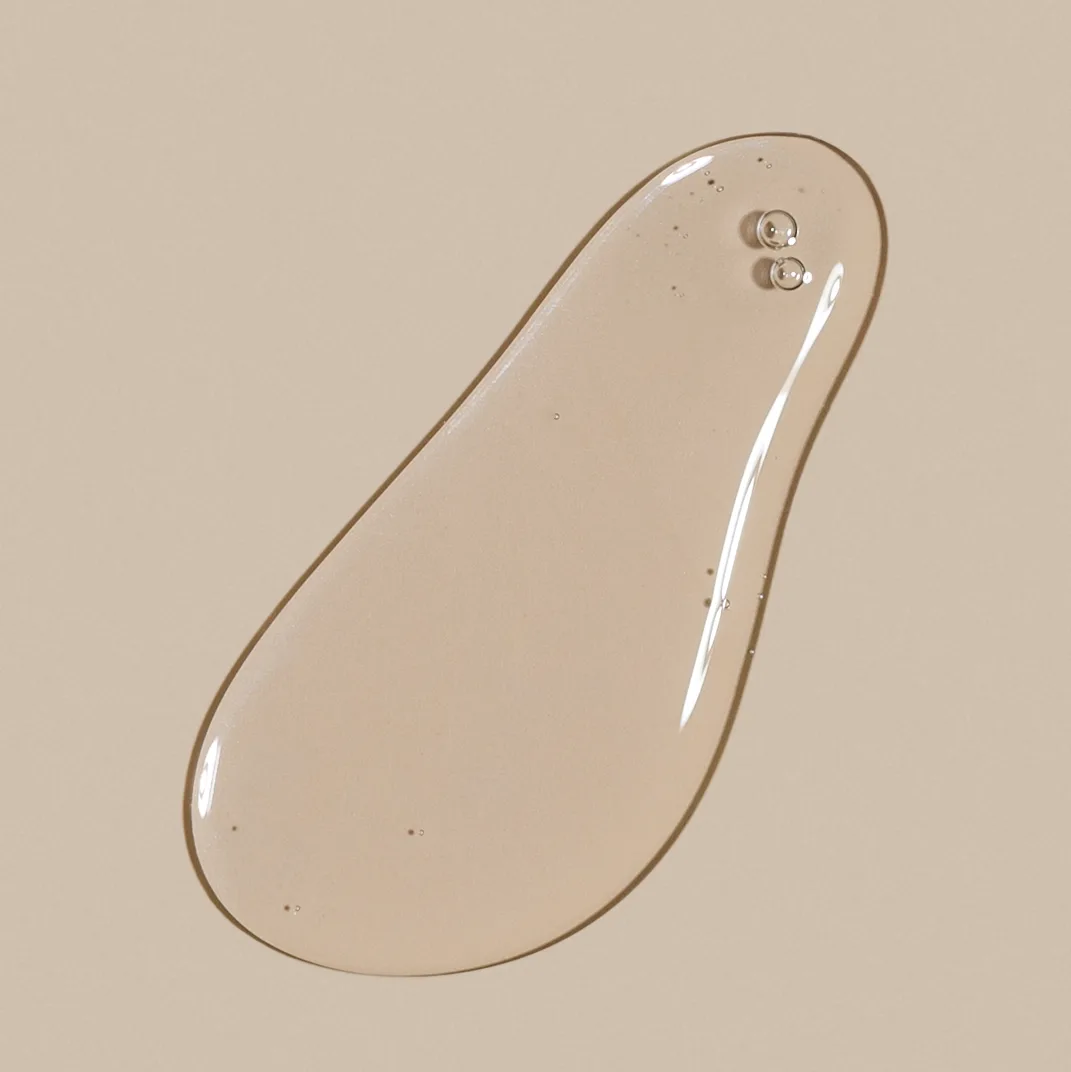
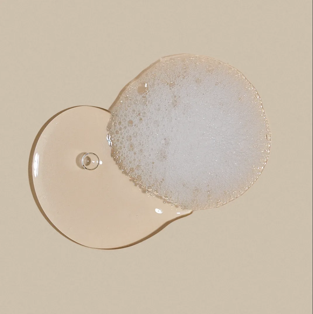
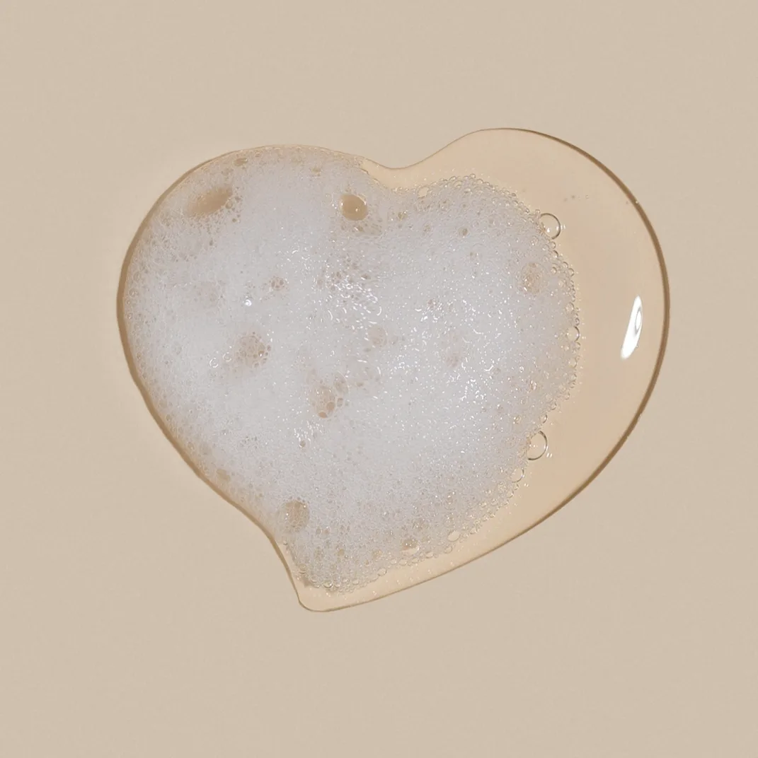
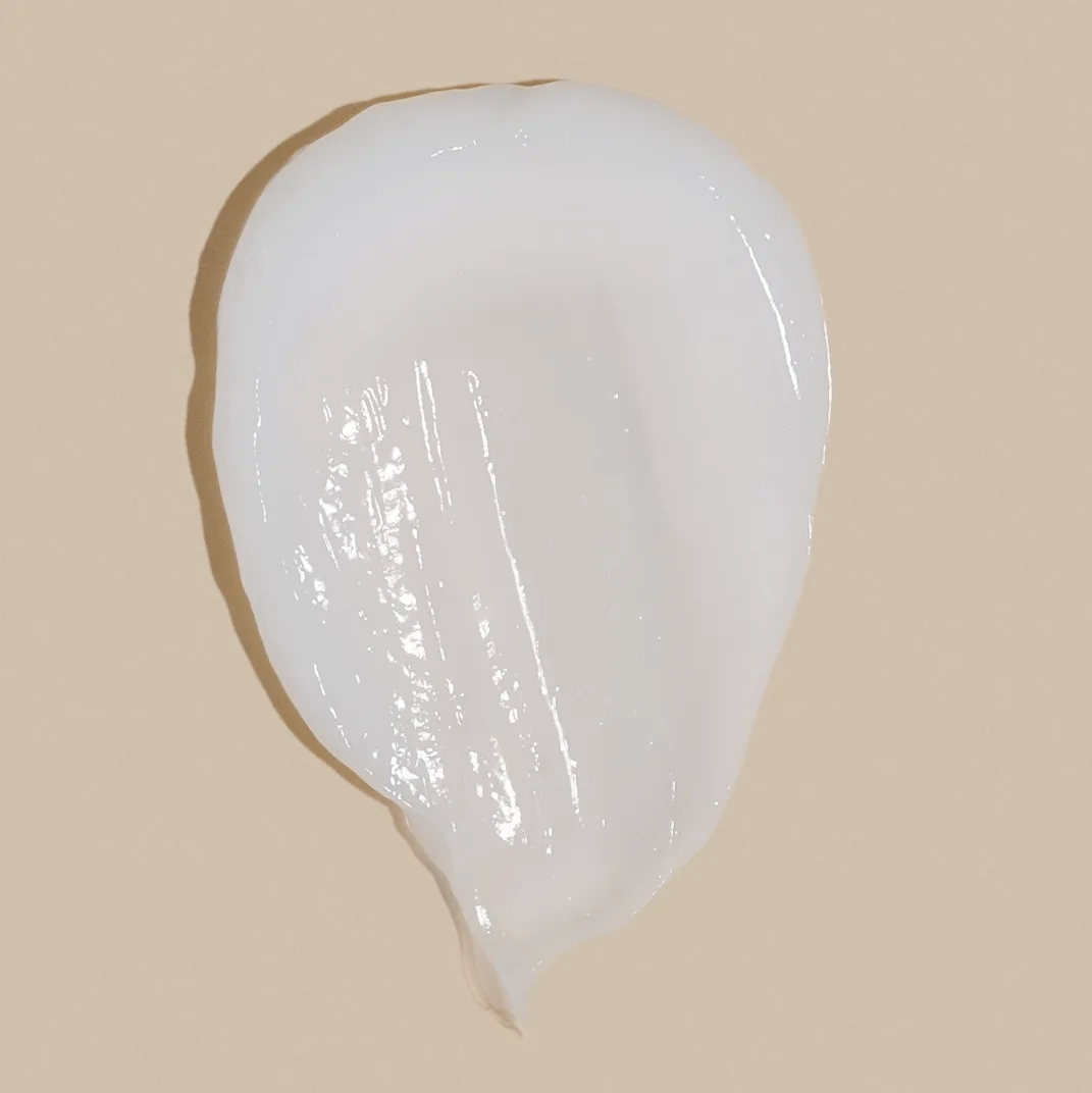
Three of the four gels (hand wash, shower gel and facial cleanser) and the conditioner’s cream, on the beige the client chose.
The facial mist
There’s almost nothing to see in a mist, so we shot four versions for the client to choose from. One was our own idea: the spray aimed at the face, the way people actually use a mist. That’s the one AMADA chose.
AMADA didn’t need models at this stage, so Olga’s hands are in the application shots, like the body lotion pour below. If AMADA wants faces later, we’ll book a model for a full series.
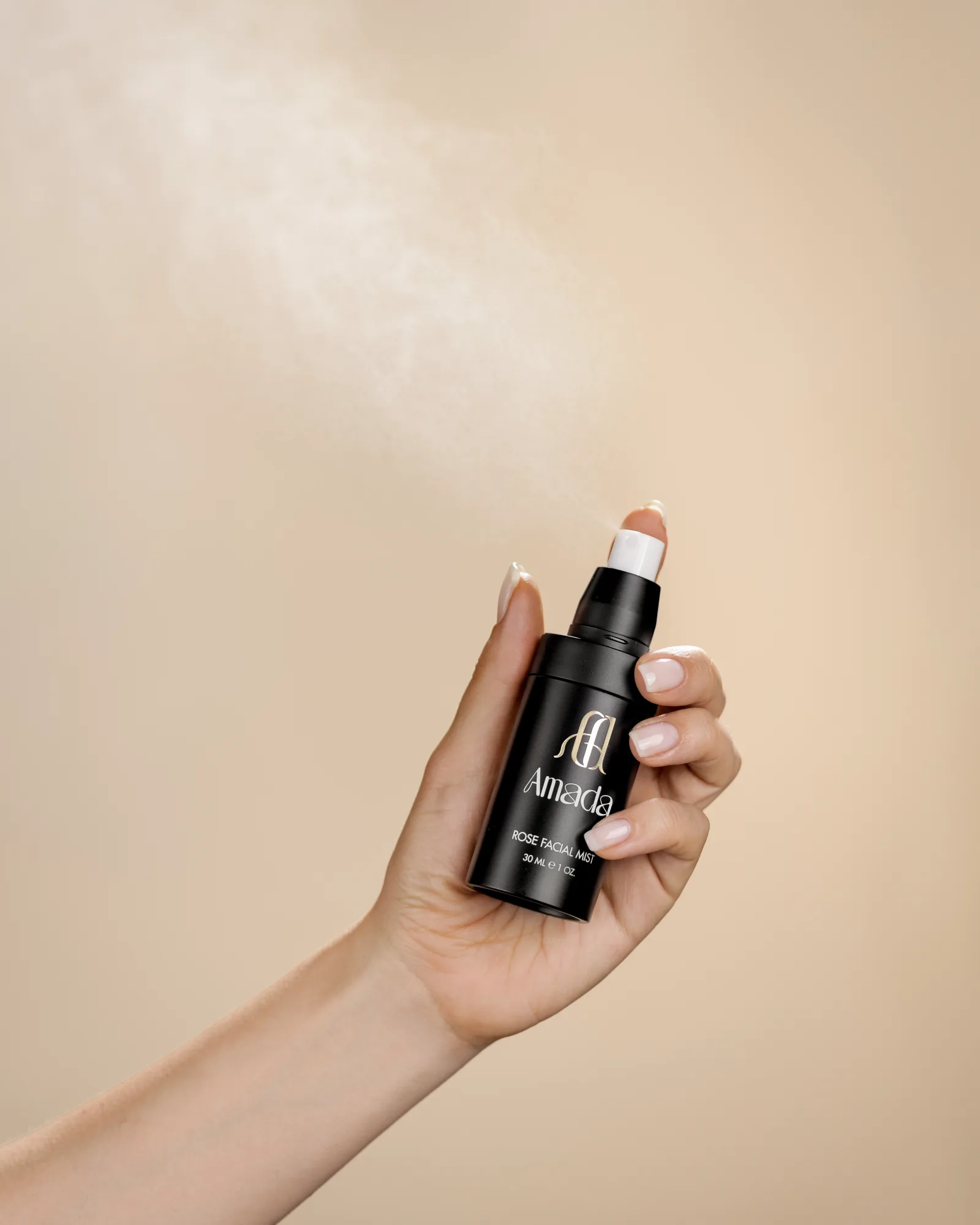
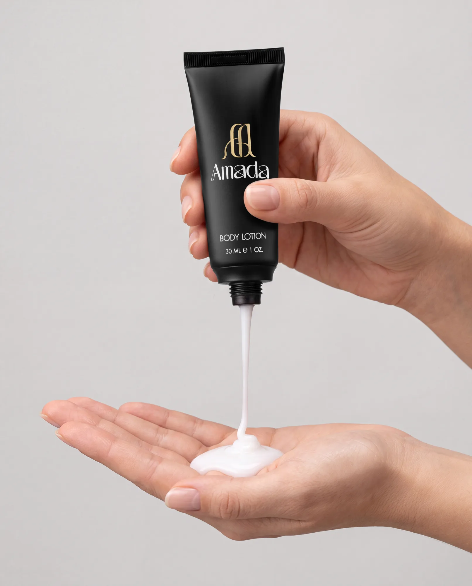
One of the other three mist options, sprayed away from the body, and the body lotion. Both are studio shots with Olga’s hands.
Scenes built around studio shots
For the creative images the client also wanted all seven products photographed together with the presentation box. We advised against it. Olga had tried arranging the tubes around it, and next to a box that size the 30 ml tubes looked tiny, which to a hotel buyer means cheap. AMADA was having a smaller box made with a slot for each product, so we agreed to wait for it.
The creative brief came back as a short list: water, rose, petals, softness, a hand. The team pointed to the images in our deck with pink petals and water drops and said that was the quiet luxury they wanted.
A location shoot wasn’t part of this stage, so we proposed building the settings digitally around our product photography. The products stayed on our table for the whole project, and whenever a scene needed another angle or light from another side, we reshot the product to match.
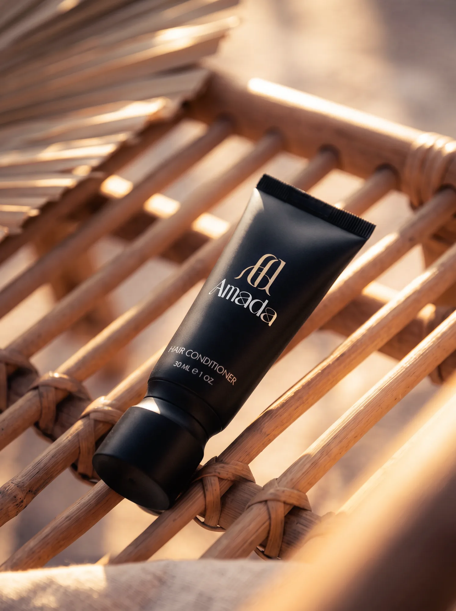
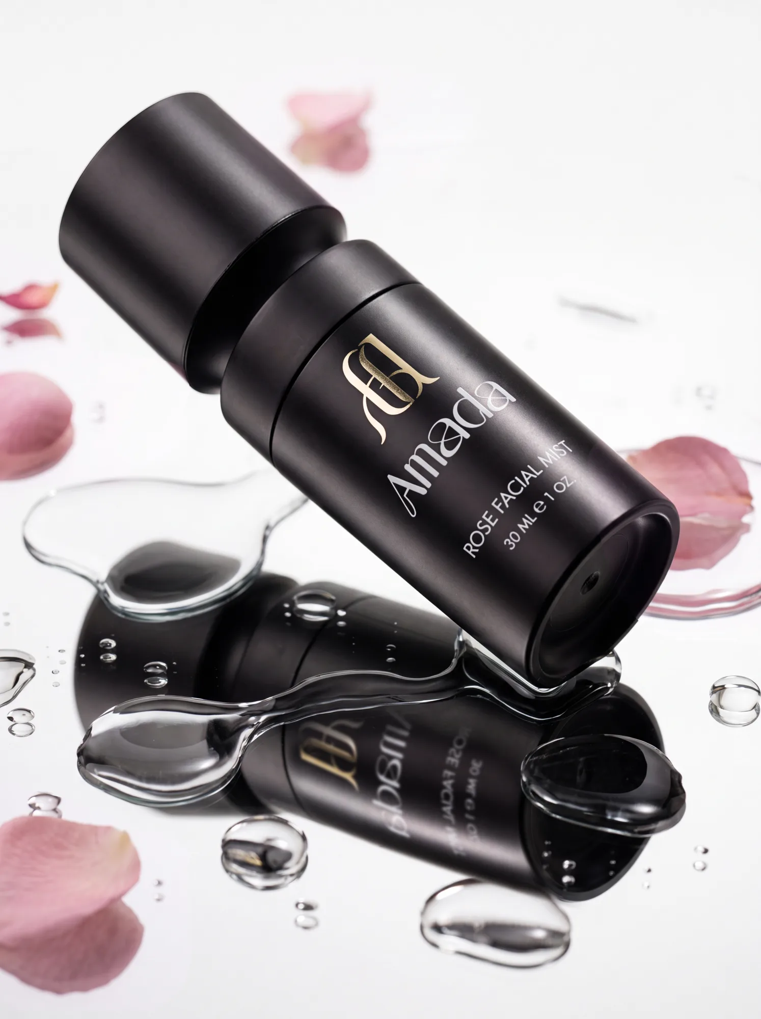
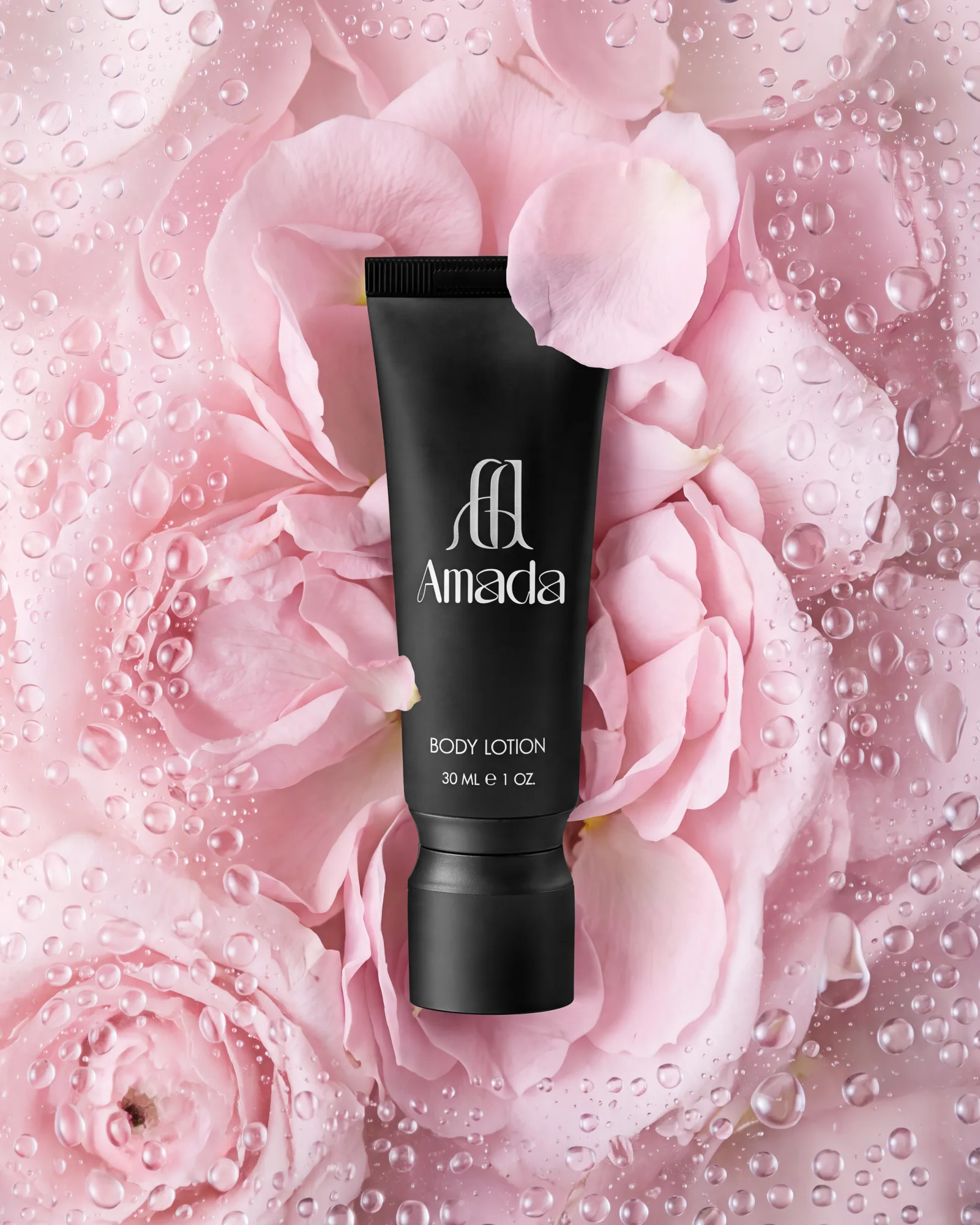
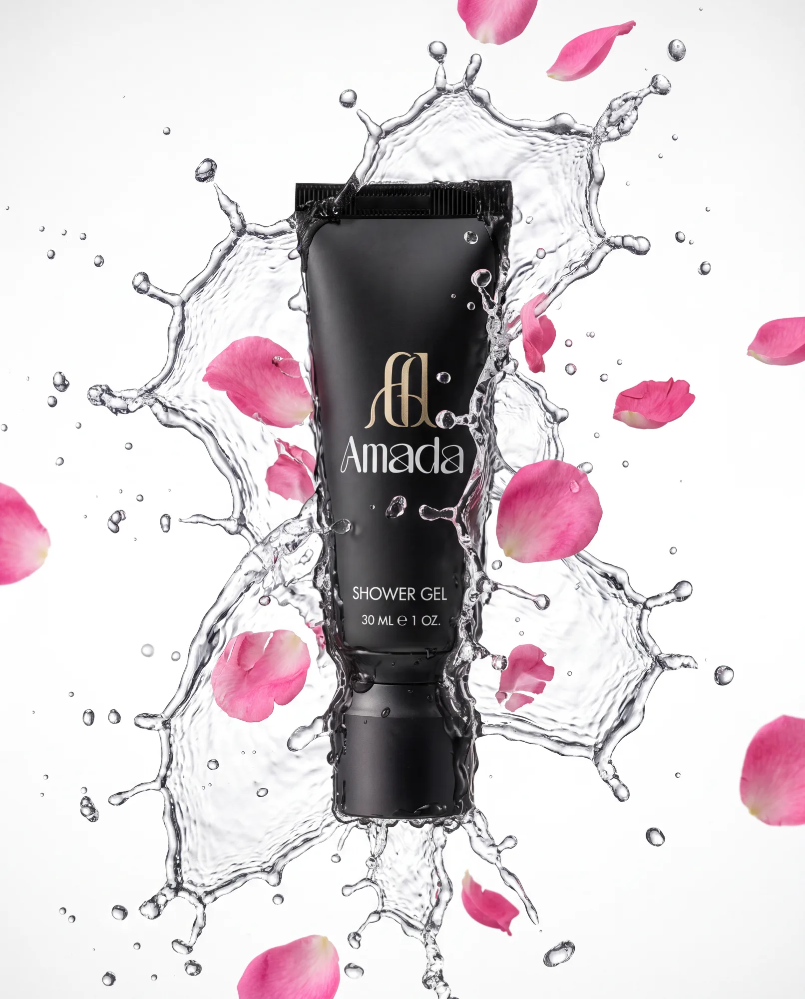
In each image above, the tube or bottle is a studio photograph. The petals, water and sunlit rattan around it are generated.
The dispensers
The range also includes large refillable dispensers for hotel showers. The client brought three samples later in the project: plain white plastic blanks, with no logo or label yet.
For the catalog we photographed them as they arrived, from the front and the back, so a buyer can see the shape, the pump and the mount that holds them on a wall bracket. Sergey, our co-founder, confirmed with the client that the catalog would show the bottles in their real white.
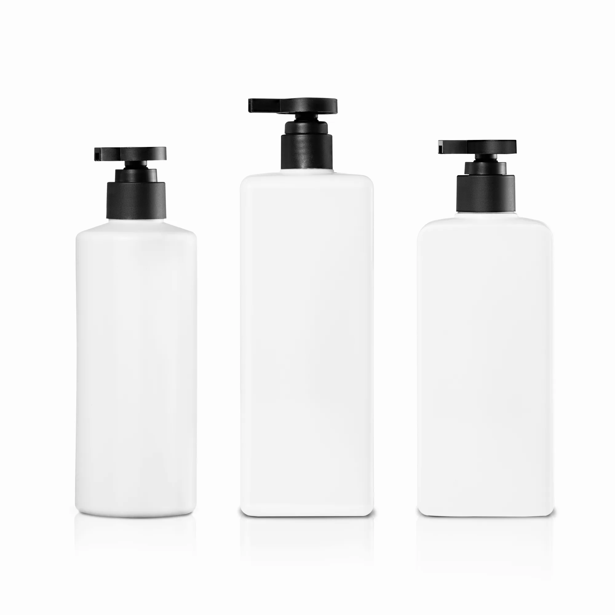
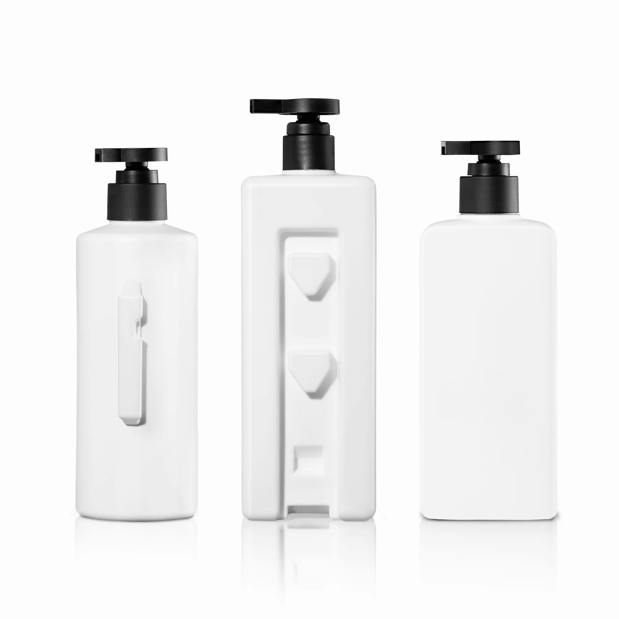
The three blanks from the front and from the back, with the wall mounts.
For the sales presentation we also made a concept image. We took one of the square blanks, recolored it to AMADA’s matte black, added the gold branding and placed three copies in a hotel bathroom scene, so buyers can see the dispensers installed before branded samples exist. We told the client up front that getting the logo to sit cleanly on a blank bottle is the hardest part of this kind of work, and that real branded samples will always photograph better. AMADA decided the concept was worth having until those samples arrive.
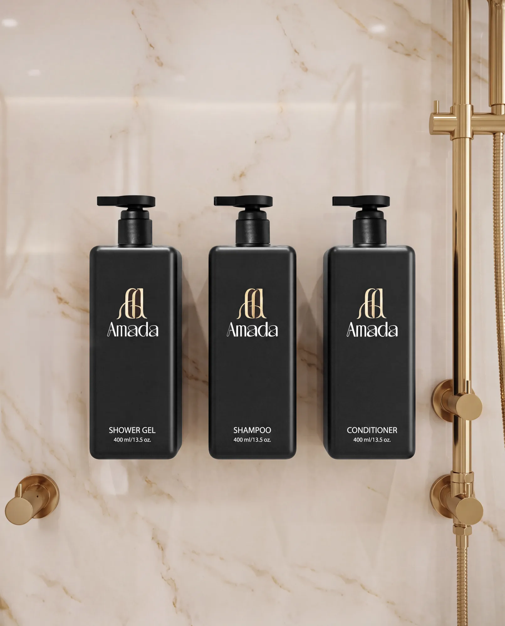
A concept for the sales presentation. The bottles are our studio shot of the white blank, recolored and branded, and the bathroom is generated. The catalog shows the real white bottles.
Where the photographs went
The final catalog files for all seven products and the dispensers went up for download along with the first creative shots. The reply came that evening: “Thank you for the photos. They’re beautiful.”
AMADA put them straight into the presentation it uses with hotel buyers, the product catalog and amadaorg.com.
AMADA came back to us in the fall for the next round of shoots.