ECOMAAT
Complete Brand Visual System: From Catalog to Packaging
The Challenge
ECOMAAT operates across a complex product ecosystem - 19+ SKUs spanning serums, fluids, sprays, creams, toners, capsules, and essential oils. But they faced a fundamental visual problem: cohesion without uniformity.
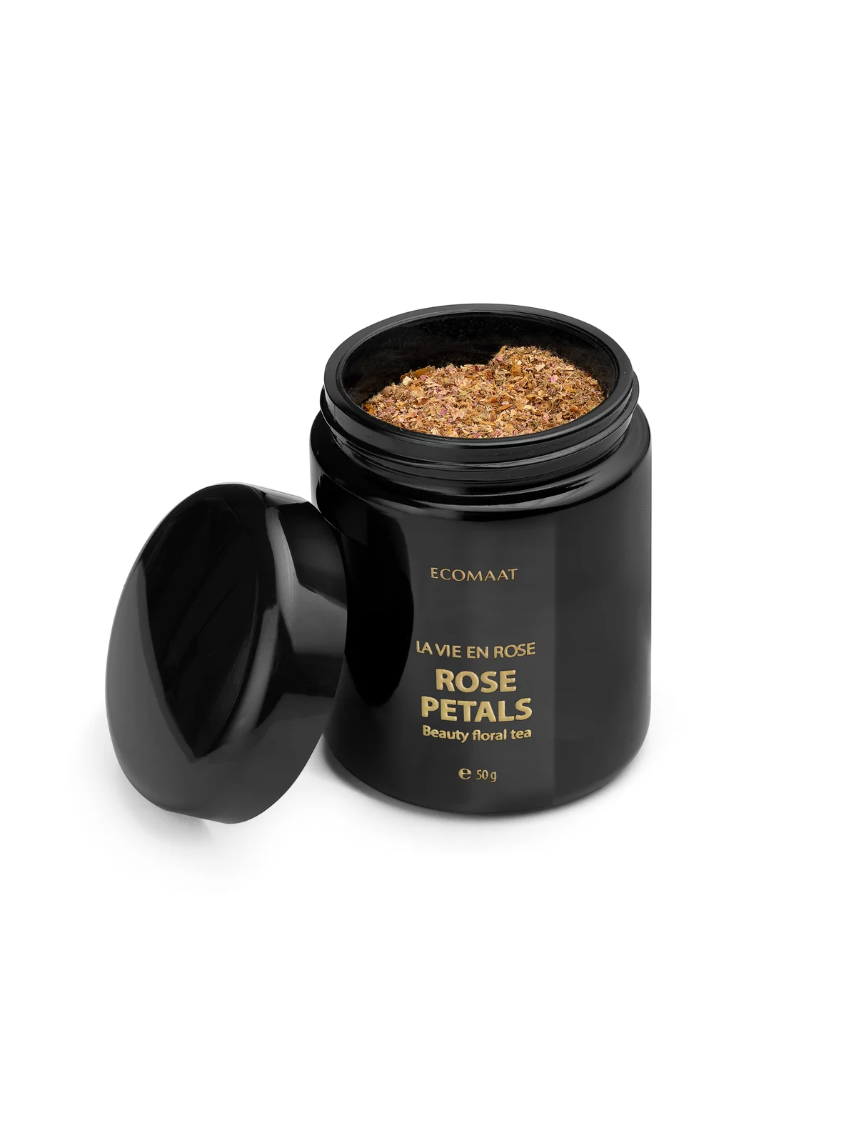
Each product category demanded different bottle architecture. Some required dark glass pumps to communicate efficacy. Others needed jars to showcase texture. Sprays and roll-ons introduced entirely different form factors. Raw ingredients like dried rose petals needed their own treatment. Yet customers needed to recognize every item instantly as belonging to one premium family.
The brief extended beyond products themselves. ECOMAAT’s luxury positioning demanded that gift packaging, branded merchandise, and wholesale presentations all share the same visual DNA - the same sense of refinement, the same technical precision in lighting and composition.
Without a coordinated catalog system, products would appear disparate. Retailers wouldn’t know how to display them together. Social media would feel fragmented. The brand’s core message - balance, honesty, purity - would get lost in inconsistent imagery.
The Catalog System
We built a unified visual language based on five non-negotiable principles:
Consistent Lighting Architecture
Soft diffused lighting across all 19+ SKUs, applied with the same technical approach:
- Light positioned to reveal, not reflect (critical for dark glass)
- Shadows soft and minimal to preserve that “spa-like tranquility” ECOMAAT communicates
- No harsh glare, no blown highlights - every label reads clearly despite the glass
Angle-Based Communication
We rejected the idea of one “hero angle.” Instead, each product was photographed from the angle that best tells its story:
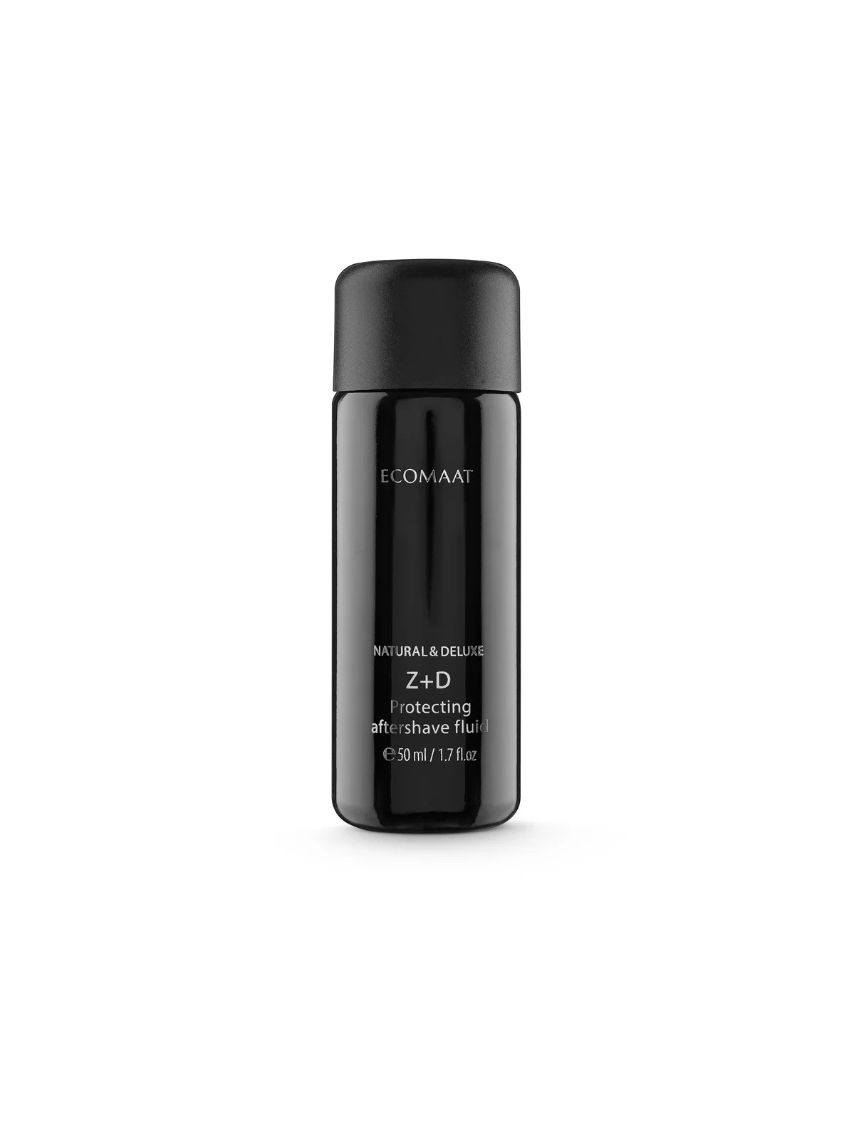
- Pump bottles: angled to show the mechanism (consumers need to understand how it dispenses)
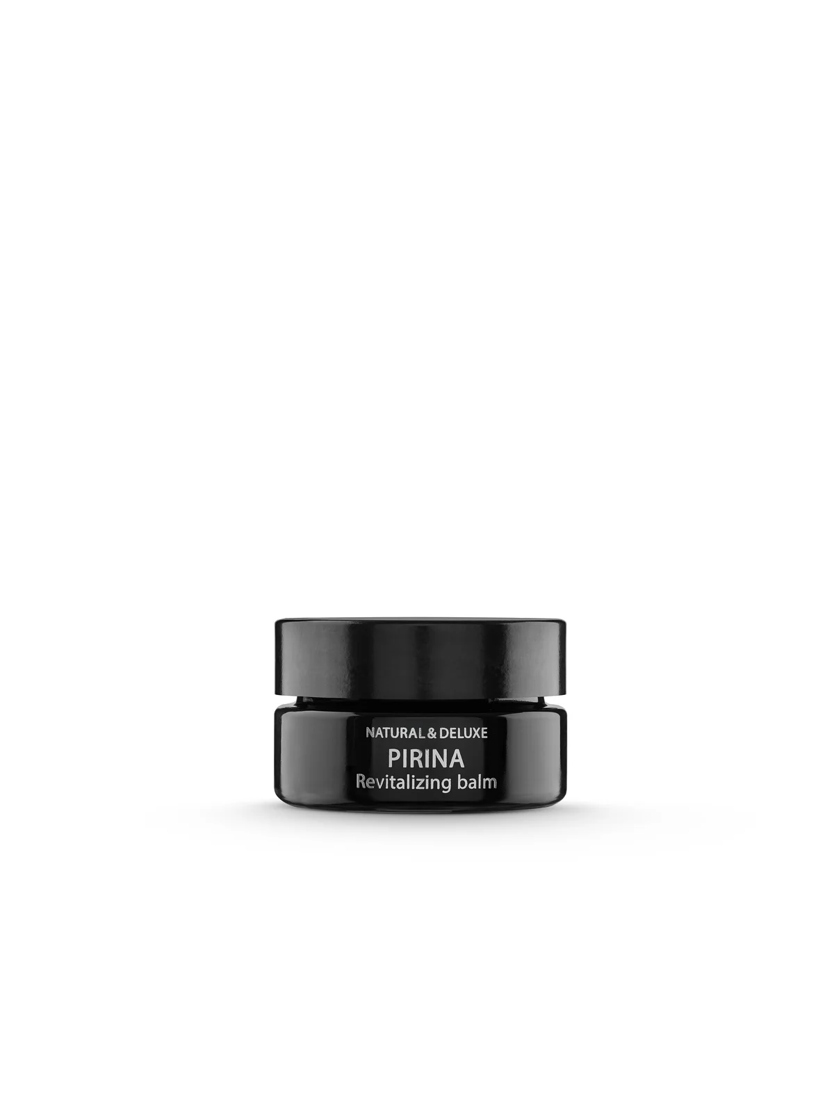
- Jars: positioned to reveal texture and thickness (communicate the cream’s richness)
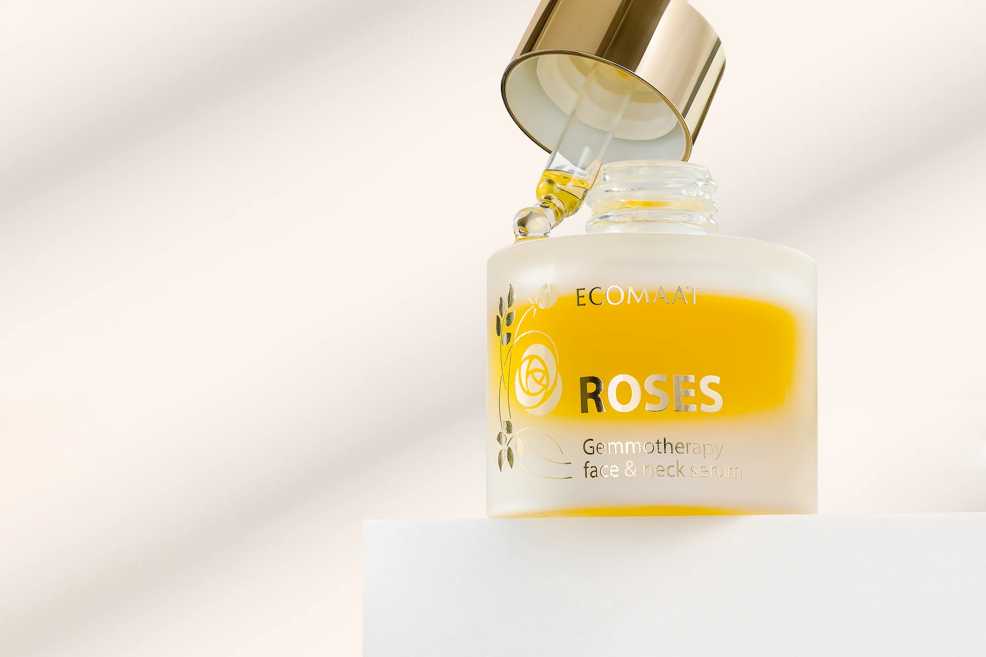
- Droppers: overhead to show the liquid color and purity
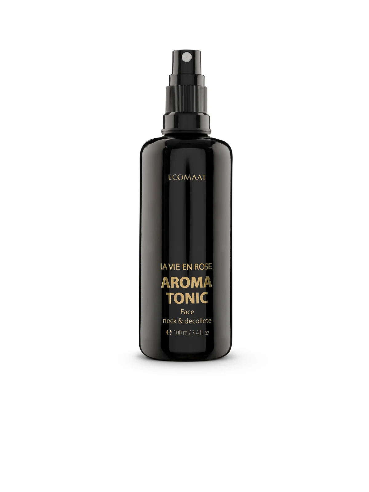
- Sprays and roll-ons: side profile to display the functional nozzle
- Capsules: multiple angles - closed jar, open with capsules visible, scattered for dramatic effect
White Background Consistency
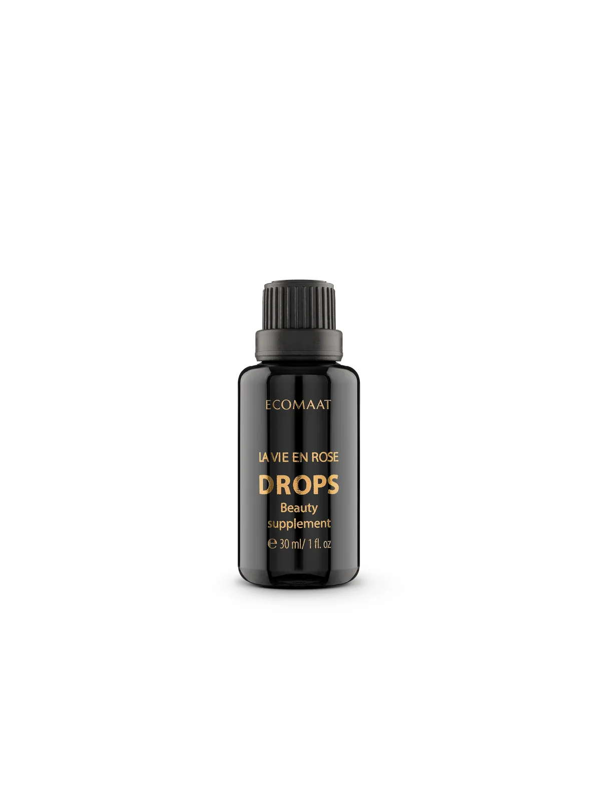
Every product photographed on a pristine white background. This isn’t minimalism for its own sake - it’s architecture. The background allows the dark glass packaging to become the visual anchor, creating recognition even when logos are small or out of focus.
Dark Glass as Signature
ECOMAAT’s dark glass bottles are protective and luxurious. We made them the visual star. The glass curves catch light in the same subtle way across every shot. Customers see that signature darkness and immediately think ECOMAAT, even before reading a single label.
Depth Through Shadow
Minimal but intentional shadows beneath each product create dimension without clutter. The shadow line is always the same softness, the same distance from the bottle. This repetition builds recognition at the visual subconscious level.
What We Created
Full Product Line: 19 SKUs in Harmony
From drops and serums to creams and essential oils - every product received catalog treatment with the same technical precision.
The most challenging group: products with vastly different shapes. A delicate dropper bottle sits awkwardly next to a squat cream jar. A tall spray looks visually dominant next to a compact roll-on. We solved this not by forcing them into a grid, but by ensuring each maintained perfect visual quality when isolated, so retailers and e-commerce platforms could arrange them by category without losing impact.
Each different from the last in form. Identical in visual confidence.
La Vie en Rose Capsules: Luxury Through Detail
ECOMAAT’s capsule product demanded special treatment. This isn’t just skincare - it’s a wellness ritual, positioning the product at the intersection of beauty and supplement.
We created a seven-image sequence that builds a narrative:
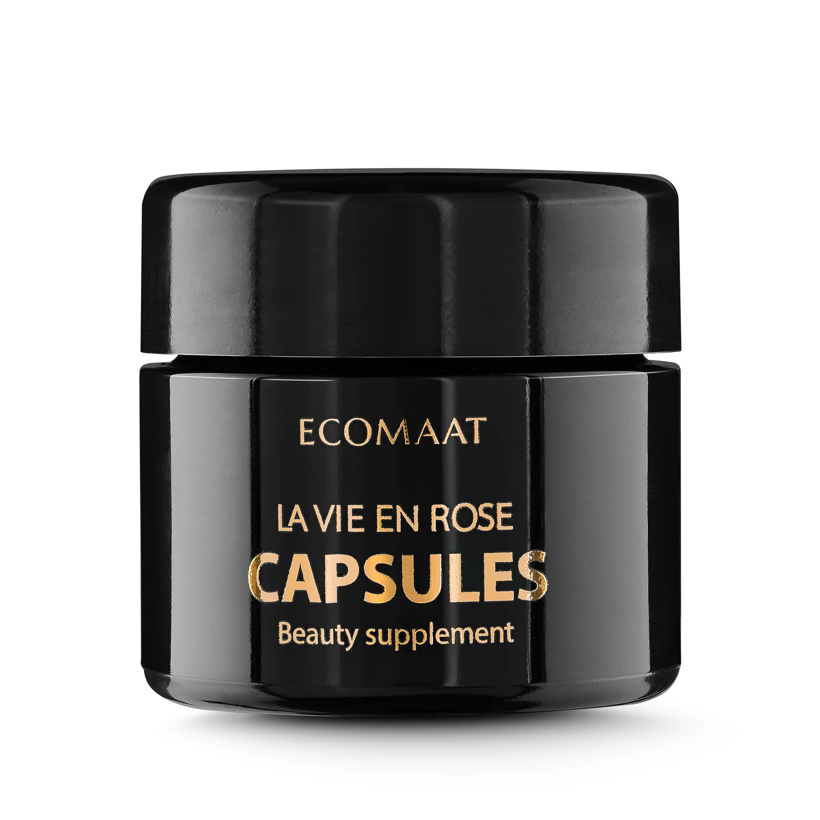
- Hero shot (#1): Closed jar, pristine, establishing luxury
- Front angle (#2): Jar facing forward, label visible, product context
- Open reveal (#3): Lid removed, gold capsules visible against creamy texture - moment of discovery
- Floating capsules (#4): Suspended mid-air, catching light, emphasizing the product’s preciousness
- Lid detail (#5): Close-up of the embossed lid, communicating craftsmanship
- Spill sequence (#6): Capsules pouring from the jar, dynamic energy
- From above (#7): Bird’s-eye view of capsules scattered on white surface - abundance, luxury, natural beauty
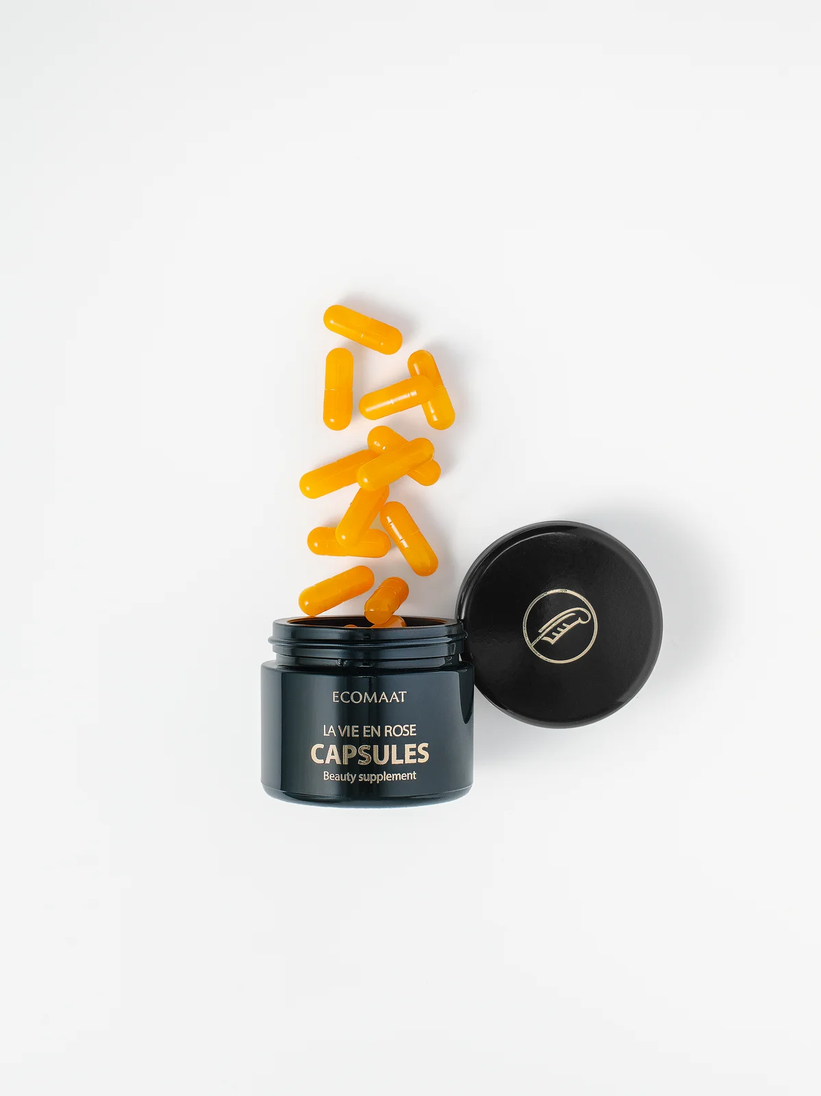
This isn’t just photography; it’s unboxing storytelling. When retailers and social media use these images, they tell customers: this product is special, considered, worth the premium price.
Gift Packaging: The Premium Unboxing Experience
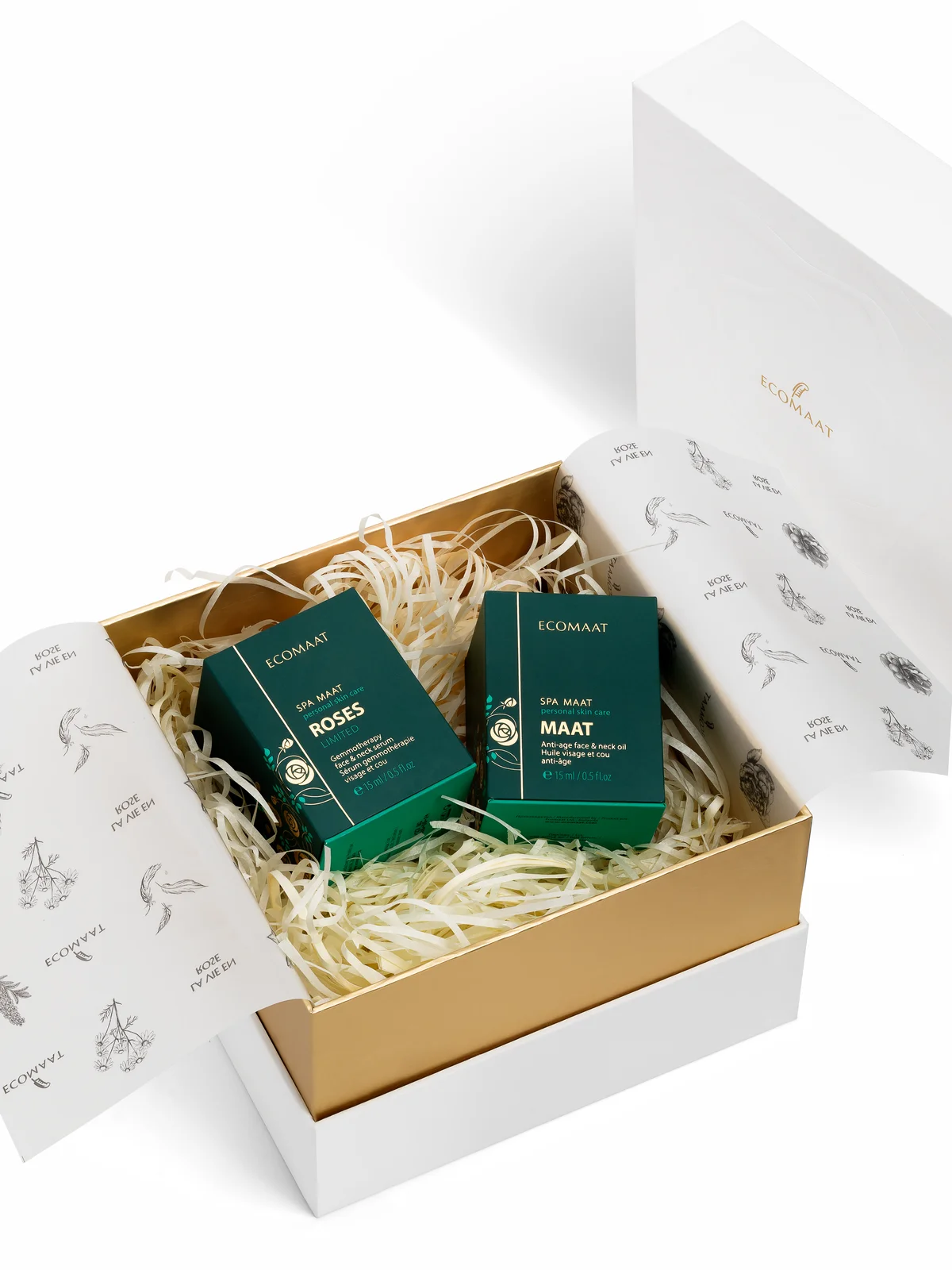
ECOMAAT’s white and gold gift box needed to communicate luxury through both closed and open states:
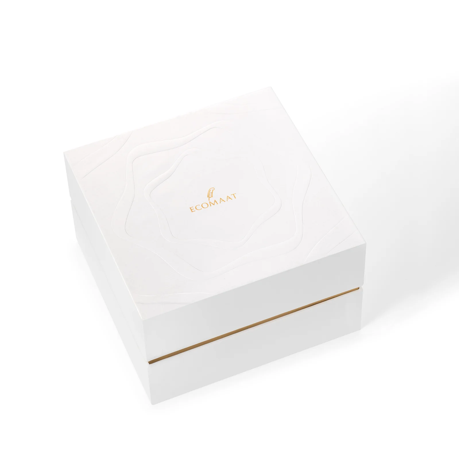
- Closed box (#1): Serene, minimalist, on white background. The box itself becomes art - clean lines, subtle dimension, hints of craftsmanship
- Open box (#2): Gold lining visible, product boxes arranged inside in a curated composition. This is the unboxing moment - the sensory first impression that justifies premium feel
- Top-down view (#3): Reveals the arrangement, showing how products are nested. Important for wholesale buyers who need to understand packaging efficiency and presentation
- Closed angle (#4): Slight rotation to show depth and the box’s structural quality
These images function as three separate communications:
- For consumers: the unboxing fantasy, the sensory reward for choosing premium
- For retailers: how to display the gift set, what it looks like when opened
- For wholesale: packaging efficiency and presentation logic
Branded Merchandise: The Extended Brand
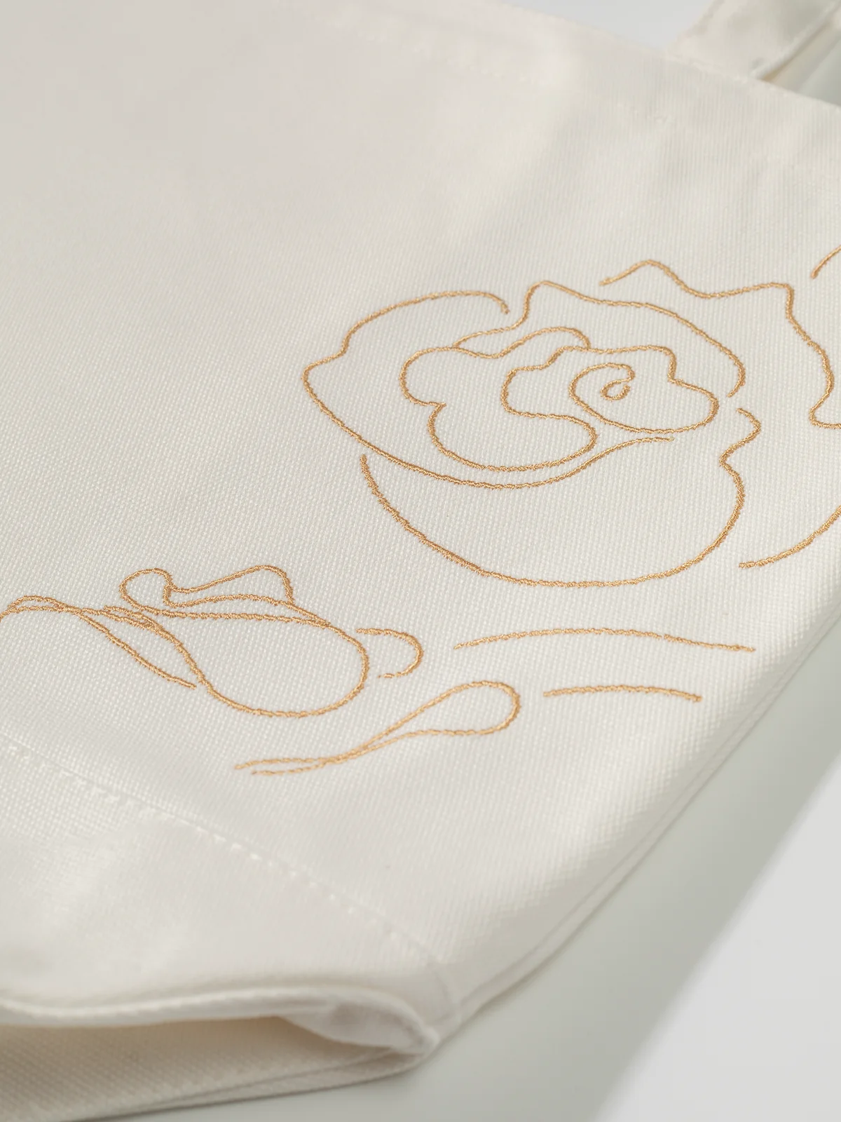
The “La Vie en Rose” tote bag extends ECOMAAT into lifestyle. But tote bags are notoriously flat in photography. We solved this through scale, context, and craft:
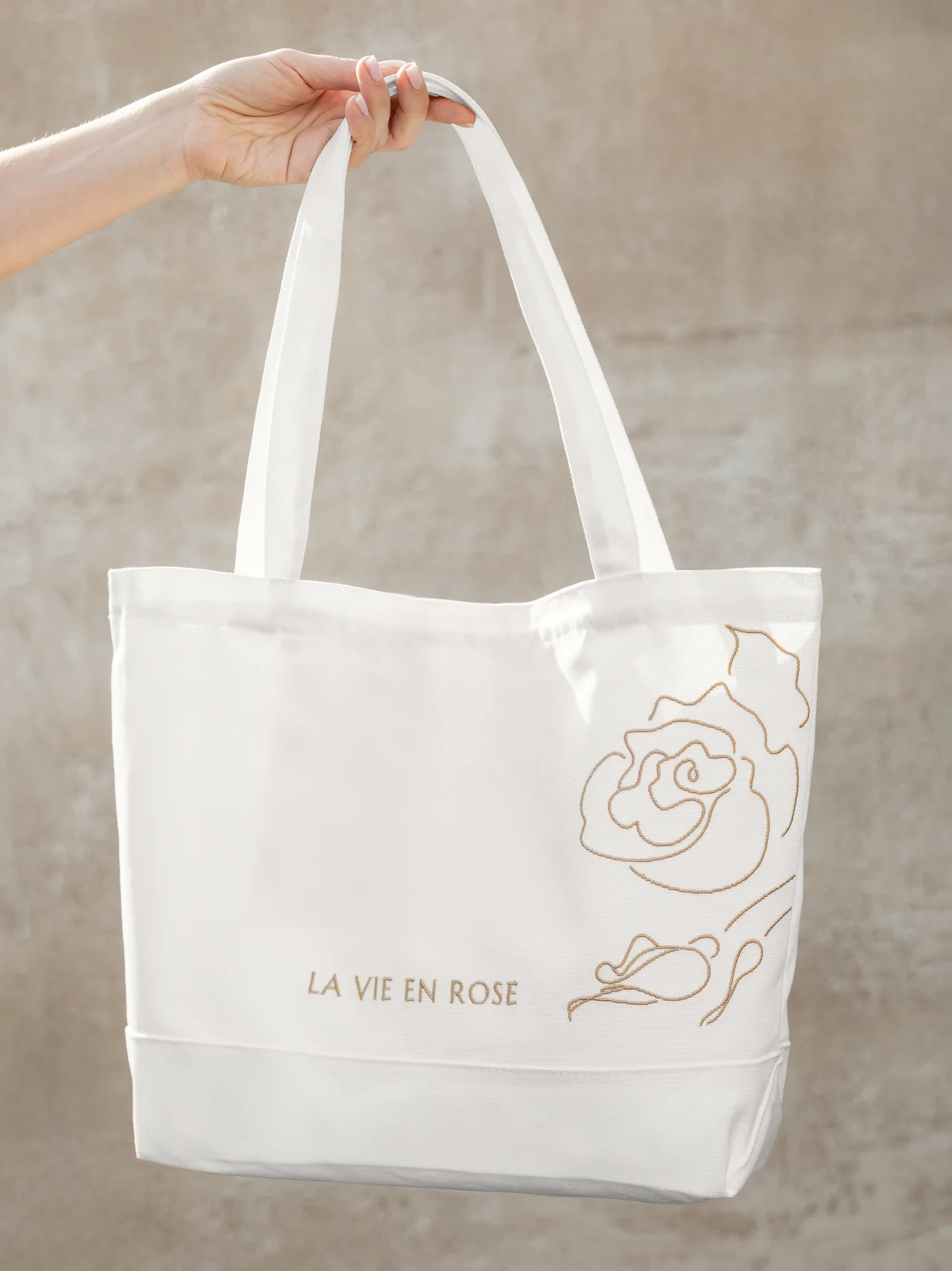
- Held in hand (#1): Shows true size, communicates weight and quality fabric, positions it as an accessory worth carrying
- Flat lay (#2): On white background for e-commerce and catalogs, displays the full design and bag shape
- Embroidery detail (#3): Close-up of the stitched logo, revealing the craftsmanship that elevates this from commodity to keepsake
The progression answers unspoken customer questions: How big is it? How does it feel? Is it worth owning? The answers accumulate through three thoughtful images.
Premium Consistency
Every image - whether it’s the 17th serum, the gift box, or the tote bag - shares the same visual DNA:
Lighting signature: Soft, diffused, never harsh. A customer scrolling through ecomaat.eu instantly recognizes the photography style.
Composition discipline: Negative space is generous. Products own the frame without feeling cramped. This breathing room communicates luxury - you’re not fighting for attention, you’re simply present.
Color palette: Dark glass against white. Gold accents in packaging and capsules. The minimal palette amplifies impact. There’s no visual noise, only refinement.
Shadow language: Every shadow falls the same gentle angle. This consistency is subtle but important - the viewer’s eye trusts the images before the brain consciously recognizes why.
Depth without distraction: Products have dimension (depth, shadow, highlight), but the composition never distracts. The product is always the singular focus. No props, no lifestyle elements, no narrative beyond the product itself.
This consistency matters across touchpoints:
- ecomaat.com, ecomaat.eu, ecomaat.co.uk, shopecomaat.com: Customers see the same visual language across all four e-commerce platforms
- Wholesale presentations: Distributors see a brand that’s visually coherent and professionally executed
- Social media: Instagram, Facebook, and retail partner feeds feel cohesive, reinforcing brand recognition
- Print catalogs: Trade shows, distributor PDFs, printed lookbooks all inherit the same premium aesthetic
The Result
What started as a 19-product photography challenge became the visual foundation for ECOMAAT’s global presence.
The catalog system delivered:
Coherence at scale: 19+ products, dozens of gift sets and merchandise variations, all sharing one visual philosophy. A customer can mix and match products or choose a gift set and know instantly that everything belongs together.
Recognition architecture: The dark glass signature is now visual shorthand for ECOMAAT. Before reading labels, customers recognize the brand. That’s the power of systematic photography.
Flexibility for commerce: Each product works in isolation (for product pages), in grid layouts (for category views), in lifestyle contexts (for social media), and in wholesale presentations (for distributor catalogs). The rigorous technical approach to lighting, angle, and background makes this adaptability straightforward.
Positioning reinforcement: Every image supports the brand’s core message: balance, honesty, purity. There’s no visual excess, no luxury-through-clutter. The clean backgrounds, the soft light, the careful angles - they all say: this brand knows exactly what it is.
Multi-market presence: Whether a customer shops ecomaat.com in North America, ecomaat.eu in Europe, or ecomaat.co.uk in the UK, they see the same refined catalog. No regional visual inconsistencies, no translation gaps through photography.
This cohesive visual system has become one of ECOMAAT’s core brand assets. It is more than a catalog. It is a promise repeated across every product, gift set, and branded piece: premium, considered, honest.
That’s ECOMAAT’s visual language. And it works.